Janus Atlas - Multi-Timeframe Auto-Levels
Price level visualization system. Displays 60+ different level types across timeframes, sessions, volume analysis, and market structure.
New to Technical Analysis? Start Here
In Plain English: Price levels are like psychological markers where price tends to bounce or stall. Think of them as "invisible walls" on your chart where buying or selling pressure tends to kick in.
DON'T PANIC about "60+ Level Types"! You absolutely do NOT need all 60+ levels. In fact, showing all of them would make your chart completely unreadable.
⚠️ IMPORTANT: Start with just 5 levels. Seriously. Just 5. You can add more later as you learn what you need.
Beginner Starting Point (Turn On Only These 5):
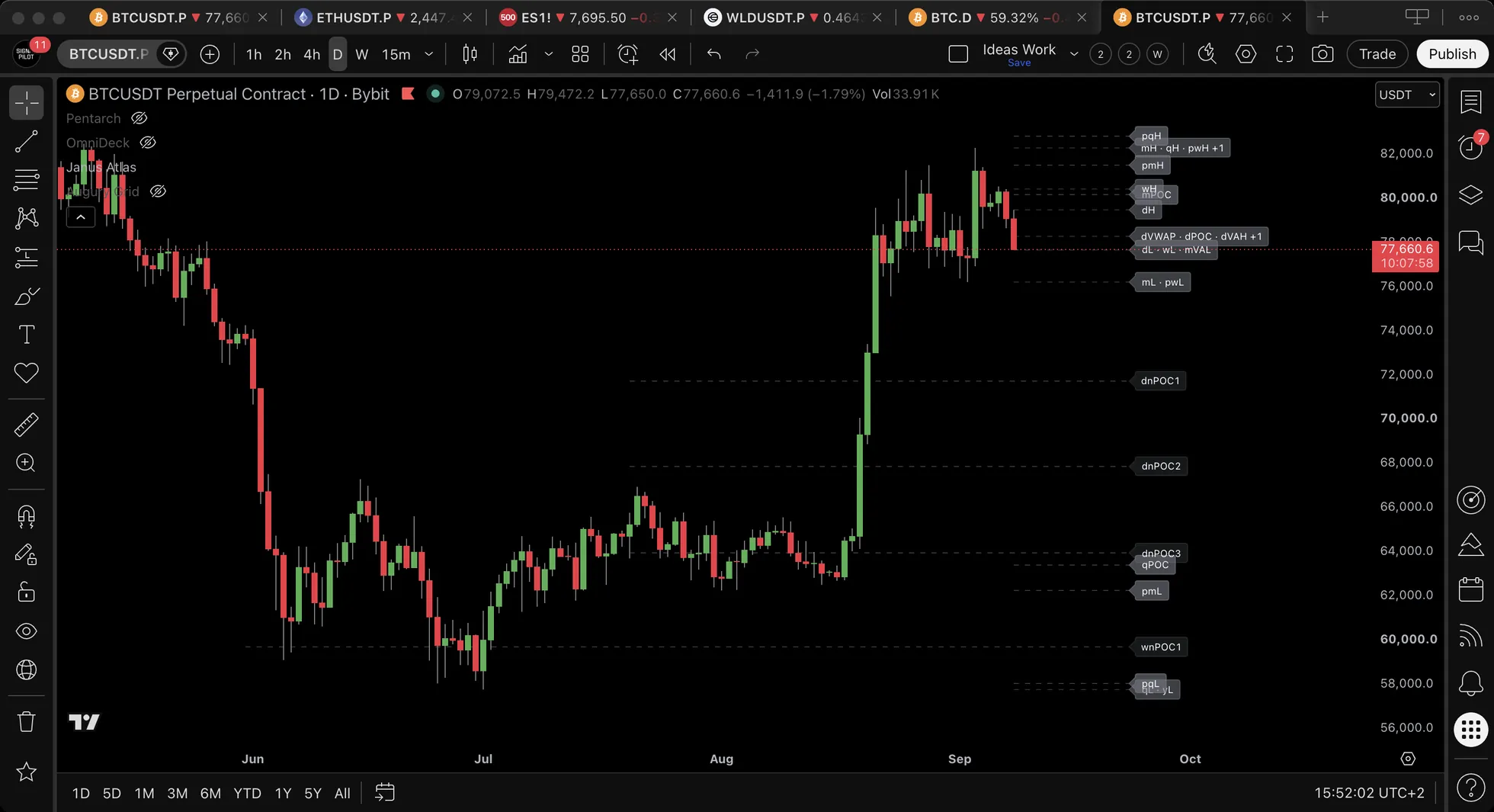
- Daily High/Low : today’s highest and lowest price so far, labelled dH and dL (yesterday’s are a separate pair, pdH and pdL)
- Weekly High/Low : this week’s extremes so far, labelled wH and wL (last week’s are pwH and pwL)
- VWAP : The "fair price" for today based on actual trading volume
- POC : Point of Control = where MOST trading happened today
- Market Structure : Recent swing highs and lows (shows trend structure)
Turn OFF everything else until you understand these 5 basics.
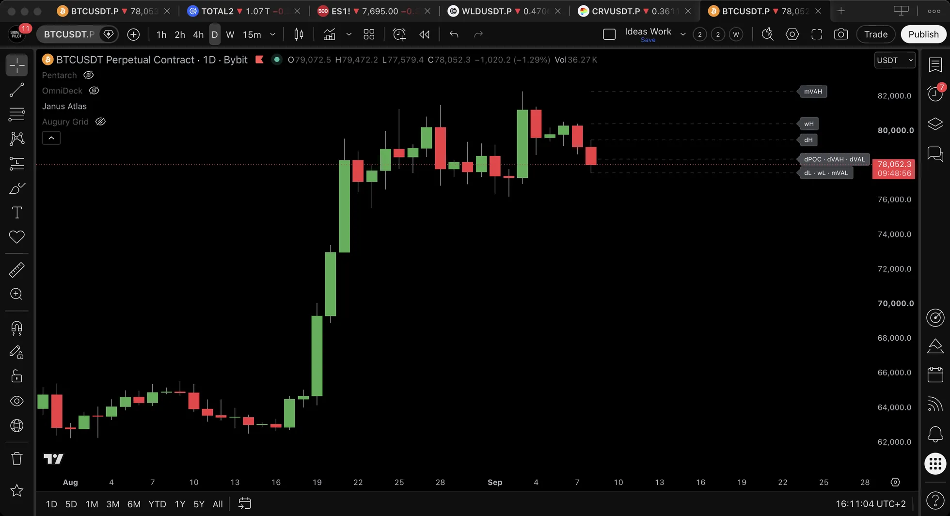
What You'll See on Your Chart:
- Horizontal lines at important price levels
- Labels telling you what each line represents (e.g., "dH" = Daily High)
- Price reactions when market touches these levels (bounces, breaks, or stalls)
🎓 What are "support" and "resistance"?
Support = A price level where buying pressure tends to kick in (price "bounces" up from here)
Think of it like a floor: price falls, hits the floor, bounces back up.
Resistance = A price level where selling pressure tends to kick in (price "bounces" down from here)
Think of it like a ceiling: price rises, hits the ceiling, bounces back down.
Why do these levels work? Because market participants remember where price reversed before. When price approaches those levels again, orders accumulate there, creating a self-fulfilling prophecy.
Key insight: Support can become resistance (and vice versa) once broken. If price breaks through a floor, that floor often becomes a ceiling later.
🎓 Understanding the 5 beginner levels
📍 VWAP (Volume-Weighted Average Price)
Plain English: The "fair price" for today based on actual trading. If price is above VWAP, buyers are in control. If below, sellers dominate.
📍 POC (Point of Control)
Plain English: The price where MOST shares/contracts traded today. Price often returns to this "magnetic" level.
📍 Daily/Weekly High/Low
Plain English: the highest and lowest price of the day and of the week so far. Participants remember where price turned, so orders gather at those prices. The previous day’s and previous week’s extremes are separate levels of their own, pdH/pdL and pwH/pwL.
📍 Market Structure (Swing Highs/Lows)
Plain English: Recent peaks and valleys. When price breaks above a recent high, that's bullish. When it breaks below a recent low, that's bearish.
Start with these 5 levels. Add more gradually as you learn what you need.
🎯 Core Functionality Beginner Friendly
60+ Level Types at a Glance
Janus Atlas organizes 60+ different level types into ten main categories:
| Category | What's Included |
|---|---|
| 📈 Classic Levels | Open, High, Low and Mid for Monday, Daily, Weekly, Monthly, Quarterly and Yearly, plus the previous period of each |
| 📊 VWAP Family | Daily/Weekly/Monthly/Quarterly/Yearly VWAP + Previous Period VWAPs |
| 📦 Volume Profile | Daily/Weekly/Monthly/Quarterly/Yearly POC, VAH, VAL |
| 🌐 Sessions | Open, High, Low and Mid for the Asian, European and North American sessions, plus two custom windows |
| 🏗️ Market Structure | BOS, CHoCH, Swing High/Low |
| ⏱️ Opening Range | orH, orL, orMid, over a window of 5, 15, 30 or 60 minutes |
| 📊 Gap Levels | Gap High, Gap Low (auto-clear when filled) |
| 🕐 Killzones | Asian, London Open, NY Open, London Cls and NY PM (background shading) |
| 📐 Fibonacci Levels | 8 fib levels (6 retracements + 2 extensions) from 20 anchor options, 2 independent sets |
| ⚓ Anchored VWAP | 4 auto-detected pivots + 4 manual anchor slots, 8 simultaneous AVWAP lines |
Plus: Confluence Zone detection, Distance Table display, 58 configurable alerts
Timeframe Compatibility: Works on all timeframes. Lines and labels display level locations and names on chart.
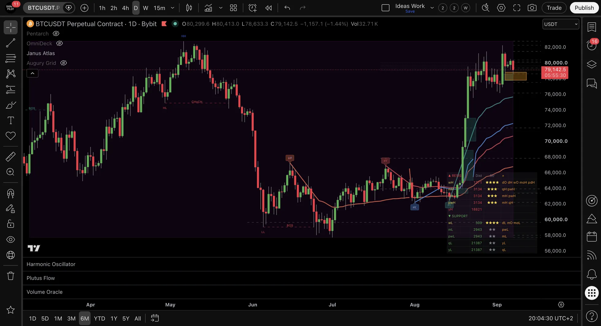
⚙️ Settings
Settings Panel Organization (18 Groups)
The settings panel is organized into 18 groups, in this order:
| # | Group | What it Controls |
|---|---|---|
| 1 | Controls | Master toggle per feature, each with its alert info in the tooltip |
| 2 | Appearance | Timezone, colors, line styles, label size and style, label combining |
| 3 | HTF Levels | Monday, Daily, Weekly, Monthly, Quarterly and Yearly O/H/L/Mid toggles |
| 4 | Session Levels | Asian, European and North American session windows and levels |
| 5 | Custom Sessions | Two user-named session windows with their own times and levels |
| 6 | Opening Range | OR session, duration and the High, Low and Mid toggles |
| 7 | Killzones | Five background shading windows with editable times and colors |
| 8 | Gap Levels | Daily and weekend gaps, minimum gap size, fill marking |
| 9 | VWAP Levels | Daily through Yearly VWAP, previous-period VWAP, standard deviation bands |
| 10 | Volume Profile | POC, VAH and VAL per period, naked POC counts, profile resolution |
| 11 | Previous Periods | PD, PMo, PW, PM, PQ and PY O/H/L/Mid toggles |
| 12 | Fibonacci Levels | Two independent sets, each with its own anchor and levels |
| 13 | Confluence Zones | Whether label strength is shown when levels converge |
| 14 | Market Structure | Pivot sensitivity, swing and break label sizes and offsets, link lines |
| 15 | Fair Value Gaps | Bullish and bearish gaps, maximum count, mitigation rule, extension |
| 16 | Distance Table | Position, layout, size, how many levels, units, strength and confluence columns |
| 17 | CME Gaps | Symbol detection, display style, maximum gaps, color and transparency |
| 18 | Anchored VWAP | Pivot lookback, lines per side, anchor markers, and four manual anchor slots |
Configuration Options
| Setting | Options | Default |
|---|---|---|
| Level Visibility | Individual on/off for each of 60+ types | Starter set enabled |
| Line Style | Solid, Dashed, Dotted | Varies by type |
| Label Display | On/Off for each level type | On |
| Label Style | Box / Text Only | Box |
| Line Width | 1-5 | 1 |
| Line Dim % | 0-50, step 5 | 15 |
| Extend Lines Right | On / Off | Off |
| Label Size | Tiny, Small, Normal, Large | Small |
Line Dim %: Dims level lines relative to labels. 0 = same brightness as the labels, 15 is the default, 30 and above is subtle. Useful for reducing visual clutter while keeping labels prominent.
Extend Lines Right: ON = lines extend across the entire chart. OFF, which is the default, stops each line at its label. Fibonacci carries its own Extend Lines Right switch, also off by default.
Label Style Option
Controls how level labels appear on the chart:
| Option | Description |
|---|---|
| Box (default) | Arrow-style label with background color |
| Text Only | Clean minimal text without box or arrow |
Location: Settings → Appearance → Label Style
What the Colours and Lines Look Like Out of the Box
Neutral grey by default
Every level colour starts grey, so a fresh chart stays readable:
- HTF Levels, Sessions, Custom Sessions
- Opening Range, Gap, VWAP, Bands
- POC, VAH, VAL, nPOC
- Previous Periods, Fibonacci, Confluence Zone
The exceptions, where colour carries meaning:
- Market Structure (blue/red for highs/lows, green/red for bull/bear)
- FVG (green demand, red supply)
- Killzones (distinct colors for bgcolor backgrounds)
Transparency Tiers:
| Tier | Transparency | Usage |
|---|---|---|
| Primary | 40% | POC, nPOC, VWAP, OR, Gap |
| Secondary | 55% | HTF, Sessions, PP, VAH/VAL, Fib |
| Background | 75% | VWAP Bands, Confluence Zone, Mitigated FVG |
Line Styles:
- There are twelve line-style inputs, one per level family
- Nine start Dashed. The three that start Dotted are the gap style and the two Fibonacci sets
- Every one of the twelve offers
Solid,DashedandDotted
Which Toggles Start On
| Setting | Starts as | Note |
|---|---|---|
| Daily H/L | ON | Part of the HTF group |
| Weekly H/L | ON | Part of the HTF group |
| Market Structure | ON | Compact HH/HL/LH/LL labels |
| Session Levels | OFF | Turn the group on and the Asian, European and North American highs and lows come with it |
| Label Combine % | 0.15% | How close two labels must be before they merge into one |
So a fresh install shows you:
- Four price lines: Daily High and Low, Weekly High and Low
- Market structure labels on the swings
- Nothing else, until you turn it on
Three Things Worth Knowing About
- Distance Table Redesign: Complete overhaul with ▲ RESISTANCE / ▼ SUPPORT split sections. New columns: Level | Dist | Str | +. Stars show total confluence (enabled + hidden). The + column reveals hidden level names that would add confluence if enabled.
- Hidden Confluence Discovery: Scans 60+ level types (HTF, Sessions, VWAP, Fib, Previous Periods, etc.) to show true zone strength before you enable features.
- Combined Confluence Labels: When multiple levels cluster at the same price, they now display as a single combined label (e.g.,
dH · wH · pdH (×3)) showing exactly which systems agree. - Market Structure Fix: First swing is now tracked silently as a reference point. HH/HL/LH/LL labels only appear starting from the second swing, when there's a valid prior swing to compare against.
Behaviour You Might Expect Otherwise
- Monday levels now visible all week: Distance Table now correctly shows Monday (start of week) levels throughout the entire week, not just on Mondays
- Text Only labels no longer overlap: When using Text Only label style, labels that are close together no longer overlap - proper spacing is maintained
- Market Structure labeling accuracy: No more misleading HH/LL labels on the first swing: labels only appear when comparison data exists
How Labels Are Written
- Distance Table colors: Red = resistance levels (above price), Green = support levels (below price), Yellow = ★★★+ high confluence, Orange = hidden levels in + column
- Label separator changed: Bullet point changed from
•to·(lighter middle dot) for a cleaner look - Price separator format: Now uses colon before price - example:
dH · wH : 91779.7 - Confluence count format: Now shows
(×2),(×3),(×4)notation to indicate how many systems agree - Killzone names shortened: Removed "KZ" suffix from killzone labels for a more compact display
Control Tooltips (Alert Info)
Each feature toggle in the Controls section now has a tooltip explaining what alerts are available. Hover over any toggle to see its alert info:
| Toggle | Tooltip (Alert Info) |
|---|---|
| HTF Levels | "Alerts: Individual for D/W (dO, dH, dL, wO, wH, wL, moO, moH, moL). Grouped for M/Q/Y." |
| Session Levels | "Alerts: Grouped as 'Sessions (Asia/Euro/NY O/H/L)' - covers all 9 session levels." |
| Custom Sessions | "Alerts: Grouped as 'Custom Sessions (CS1/CS2 H/L)'." |
| Opening Range | "Alerts: Individual (orH, orL)." |
| Gap Levels | "Alerts: Individual (gapH, gapL, Gap Filled)." |
| VWAP Levels | "Alerts: Individual for D/W (dVWAP, wVWAP, pdVWAP). Grouped for M/Q/Y and prev periods." |
| Volume Profile | "Alerts: Individual for D/W (dPOC, dVAH, dVAL, wPOC, wVAH, wVAL). Grouped for M/Q/Y." |
| Previous Periods | "Alerts: Individual for PD (pdO, pdH, pdL) and PMo (pmoO, pmoH, pmoL, pmoMid). Grouped for PW/PM/PQ/PY." |
| Fibonacci Levels | "Alerts: Grouped as 'Fib Level Touched' - fires when any enabled fib is touched." |
| Confluence Zones | "Alerts: 'Confluence Zone' - fires when multiple levels cluster together." |
| Market Structure | "Alerts: Individual (CHoCH 🟢/🔴, BOS 🟢/🔴)." |
| Fair Value Gaps | "Alerts: Individual (FVG 🟢 Bullish, FVG 🔴 Bearish)." |
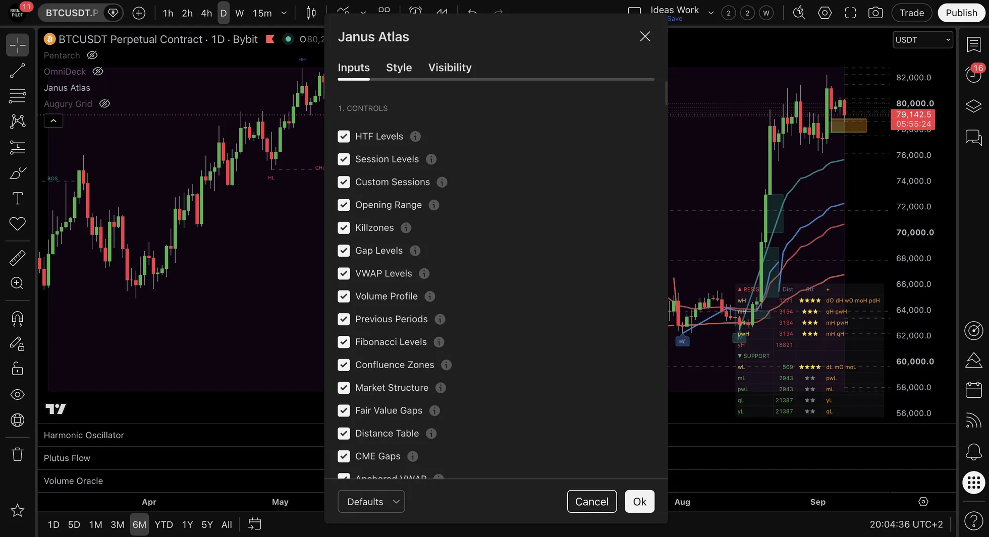
✅ Knowledge Check
Question: How many different level types does Janus Atlas display?
📊 A Worked Example: Reading a Cluster
(An illustration with round numbers, not a record of any real session. Educational only. Not financial advice.)
What the chart shows, bar by bar:
| Bar | Price | Levels there | What it means |
|---|---|---|---|
| 1 | 4,250 | Weekly Low, POC and Monthly VWAP all within 0.2% | Three systems name the same price |
| 2 | 4,290 | Price has left the cluster upward | 40 points off the zone |
| 3 | 4,350 | Clear of all three levels | 60 more, so 100 from bar 1 |
The arithmetic: 4,250 to 4,290 is 40 points, and 4,290 to 4,350 is 60 more, so 100 from where the cluster sat. On the chart the three levels would carry one combined label, wL · POC · mVWAP (×3), because they fall inside the 0.5% proximity setting.
What the example does and does not show: it shows what a cluster looks like and how it is labelled. It does not show that clusters hold. The same three levels could have been cut straight through on the next bar, and the label would have looked exactly the same beforehand.
Remember: Levels don't always hold: they're zones of interest, not guarantees. Watch for price confirmation (reversal candles, volume spikes, or momentum shifts) before assuming a level will support or resist. Some level touches lead to bounces, others lead to breakouts. The key difference is usually confirmation from other indicators.
📍 Level Type Descriptions Intermediate
📅 Timeframe Levels (Daily/Weekly/Monthly/Quarterly/Yearly)
What Displays: Lines labeled dH, dL, wH, wL, mH, mL, QH, QL, YH, YL (plus opens, closes, midpoints)
| Level | Definition |
|---|---|
| Daily High/Low | Today's price range extremes |
| Weekly High/Low | Current week's price range extremes |
| Monthly High/Low | Current month's price range extremes |
| Quarterly High/Low | Current quarter's price range extremes |
| Yearly High/Low | Current year's price range extremes |
| Opens | Period opening prices |
| Midpoints | Calculated center of period range |
Characteristics:
- Price reactions occur at these levels
- The longer the period, the more participants have the level drawn and the longer it stays relevant
- That is the argument for weighting weekly above daily, and quarterly and yearly above both: audience, not magic
- Clusters of multiple levels indicate zones of interest
Example: Bitcoin declines to Weekly Low at $65,000 → Bounce reaction observed (support characteristics).
🕐 Session Levels (Asian/European/North American)
What Displays: Lines labeled AH, AL (Asian), EH, EL (European), NAH, NAL (North American)
| Session | Definition |
|---|---|
| Asian Session | Tokyo trading hours range |
| European Session | London trading hours range |
| North American Session | New York trading hours range |
Each session shows: High, Low, Open, Close
Characteristics:
- Session highs/lows often tested during subsequent sessions
- Asian lows often swept during London open
- North American highs act as resistance levels
- Session breaks indicate liquidity characteristics
Example: Price spikes above Asian High at $66,500, immediately reverses → Session high sweep pattern (liquidity grab characteristics).
💰 VWAP Lines (Volume-Weighted Average Price)
What Displays:
- Lines labeled: dVWAP (daily), wVWAP (weekly), mVWAP (monthly), qVWAP (quarterly), yVWAP (yearly)
- Also shows previous period VWAP: pdVWAP, pwVWAP, pmVWAP, pqVWAP, pyVWAP
Level Definition:
- VWAP = Volume-weighted average price
- Represents "true average" where most volume traded
- Calculated as cumulative (volume × price) / cumulative volume
Characteristics:
- Price above VWAP = Bullish positioning
- Price below VWAP = Bearish positioning
- Price returns to VWAP (magnet effect observed)
- Professional reference level
Example: Price spikes to $68,000, VWAP at $66,000 → Pullback to VWAP level observed.
📊 VWAP Standard Deviation Bands
What Displays:
- Additional lines above and below each VWAP showing ±1σ and ±2σ deviation bands
- Labels:
d+1σ,d-1σ,d+2σ,d-2σ(and same for w/m/q)
Level Definition:
- Standard deviation bands around VWAP showing how far price has deviated from the volume-weighted average
- ±1σ would hold about 68% of the deviations, and ±2σ about 95%, if they were normally distributed
- Real price has fatter tails, so more touches land outside the bands than those figures suggest
Configuration:
| Setting | Description |
|---|---|
| Daily VWAP + Bands | Toggle bands for Daily VWAP |
| Weekly VWAP + Bands | Toggle bands for Weekly VWAP |
| Monthly VWAP + Bands | Toggle bands for Monthly VWAP |
| Quarterly VWAP + Bands | Toggle bands for Quarterly VWAP |
| Yearly VWAP + Bands | Toggle bands for Yearly VWAP (yVWAP) |
| Show Previous Period | Toggle previous period VWAPs (pyVWAP, etc.) |
| Show ±1σ | Enable first standard deviation bands |
| Show ±2σ | Enable second standard deviation bands |
| Band Color | Separate color picker from main VWAP line |
Characteristics:
| Condition | Interpretation |
|---|---|
| Price at +2σ | Stretched well above the volume-weighted average for the period |
| Price at -2σ | Stretched well below it |
| Tighter bands | Low volatility environment |
| Wider bands | High volatility environment |
Interpretation:
- Price at the upper bands (+1σ/+2σ) = extended above the mean
- Price at lower bands (-1σ/-2σ) = Extended below mean, bounce likely
- Price returning to VWAP = "Fair value" / mean reversion target
Labels:
| Label | Meaning |
|---|---|
d+1σ | Daily VWAP + 1 standard deviation (upper) |
d-1σ | Daily VWAP - 1 standard deviation (lower) |
d+2σ | Daily VWAP + 2 standard deviations (upper) |
d-2σ | Daily VWAP - 2 standard deviations (lower) |
Same pattern for weekly (w), monthly (m), quarterly (q), yearly (y)
Yearly VWAP (yVWAP):
- Volume-weighted average price anchored to the calendar year
- Key reference for long-term mean reversion
- Use case: Major S/R for position analysis and macro context
Example: price at the Daily VWAP +2σ band ($69,500) while the VWAP itself sits at $67,000. That is a $2,500 stretch, two standard deviations of the session so far. It says the move is unusual for this session, not that it is over.
🎯 Volume Profile (POC, VAH, VAL)
What Displays:
| Level | Description |
|---|---|
| POC (Point of Control) | Horizontal line at highest volume price (strongest magnet effect) |
| VAH (Value Area High) | Upper edge of the value area: the band between VAL and VAH holds about 70% of the period’s volume |
| VAL (Value Area Low) | Lower edge of that same 70% band |
Available Timeframes:
| Timeframe | Labels | Use Case |
|---|---|---|
| Daily | dPOC, dVAH, dVAL | Intraday analysis, intraday levels |
| Weekly | wPOC, wVAH, wVAL | Multi-day analysis, swing levels |
| Monthly | mPOC, mVAH, mVAL | Position analysis, monthly context |
| Quarterly | qPOC, qVAH, qVAL | Longer-term position analysis reference |
| Yearly | yPOC, yVAH, yVAL | Major S/R for macro analysis |
Characteristics:
- POC acts as strong magnet (repeated price returns observed)
- Above VAH = Extended above fair value
- Below VAL = Extended below fair value
- Value area contains "fair value" zone
Quarterly & Yearly Volume Profile: Identifies where the majority of volume occurred over longer periods. Key reference for position analysis and macro context.
Example: Price at $69,000, POC at $67,000 → Pullback to POC observed (magnet effect).
🧲 Naked POC (nPOC)
What Displays: Lines whose labels follow this pattern: dnPOC1, dnPOC2, wnPOC1
What it is: Previous session POC levels that price hasn't touched yet. They act as "magnets" because high-volume areas tend to attract price back.
Settings:
| Input | Default | Description |
|---|---|---|
| Daily nPOC | Off | Show previous daily POCs not yet touched |
| Count | 5 | Number of daily nPOCs to track (1-10) |
| Weekly nPOC | Off | Show previous weekly POCs not yet touched |
| Count | 3 | Number of weekly nPOCs to track (1-5) |
| nPOC Color | Gray | Color for nPOC lines |
How it works:
- When a new day/week starts, the previous session's POC is saved
- Each saved POC is monitored for price touches
- When price wicks through the level, the nPOC is "filled" and removed
- Remaining nPOCs continue displaying until touched
Labels: dnPOC1, dnPOC2, etc. (most recent = 1, oldest = highest number)
Why it matters:
- Naked POCs are unfilled magnets - price tends to return to them
- Multiple nPOCs at similar levels = stronger attraction zone
- When price fills an nPOC, it often reverses or consolidates
Use Case: Monitor unfilled nPOCs as potential price targets, or use them as S/R zones.
Example: Yesterday's POC at $67,500 wasn't touched today → Shows as dnPOC1 → Price often gravitates back to fill it.
📈 Market Structure (Swing Points & Breaks)
What Displays:
- Labels at swing points: HH (Higher High), HL (Higher Low), LH (Lower High), LL (Lower Low)
- Break labels: BOS (Break of Structure), CHoCH (Change of Character)
| Label | Definition |
|---|---|
| HH/HL | Uptrend swing pattern (higher highs, higher lows) |
| LH/LL | Downtrend swing pattern (lower highs, lower lows) |
| BOS | Break of Structure - trend continuation indication |
| CHoCH | Change of Character - reversal warning |
How swing detection works:
📐 Swing Labeling Logic
The first swing is tracked silently as a reference point: no label appears. HH/HL/LH/LL labels only appear starting from the second swing, when there's a valid prior swing to compare against.
Why this matters:
- The first swing on chart has nothing to compare to: calling it "HH" or "LL" would be meaningless
- Labels only appear when the indicator can make a valid comparison (higher than previous high? lower than previous low?)
- This prevents false/misleading labels at the start of your chart view
Characteristics:
- HH → HL → HH pattern = Uptrend structure
- LH → LL → LH pattern = Downtrend structure
- BOS labels indicate trend continuation
- CHoCH labels indicate potential reversal
Example Pattern:
Swing 1: [silent reference - no label]
Swing 2: HL (confirmed higher than Swing 1's low)
Swing 3: HH (confirmed higher than Swing 1's high)
Swing 4: HL → BOS triggers on breakout
Market structure provides trend context. Individual interpretation varies.
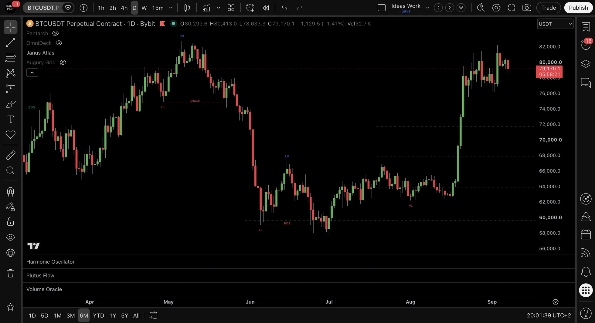
⏱️ Opening Range (OR)
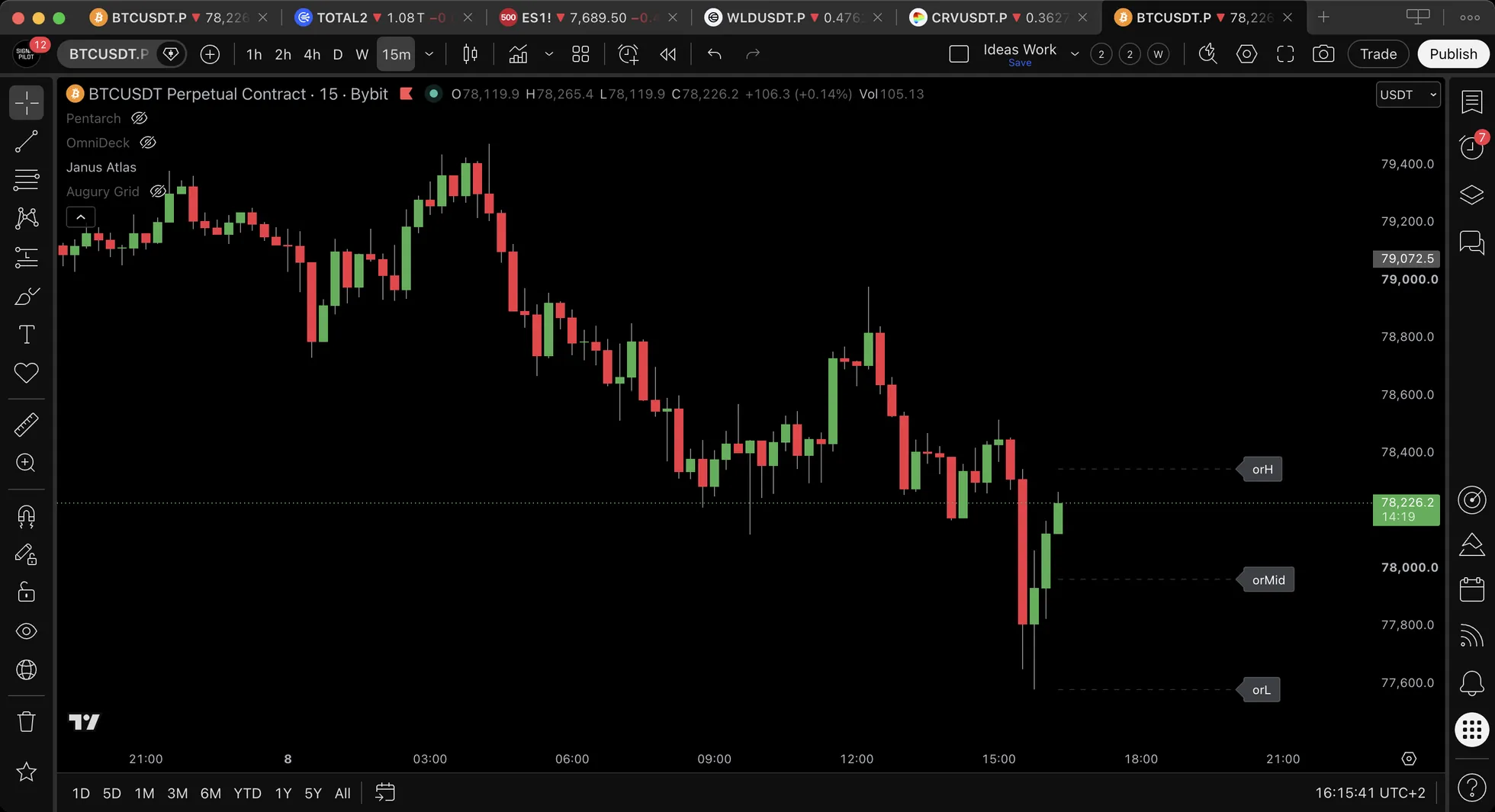
What it does: Captures the high and low of the first X minutes of a trading session, creating a "launchpad" for the day.
What Displays:
- orH - Opening Range High
- orL - Opening Range Low
- orMid - Opening Range Midpoint (optional)
Configuration:
| Setting | Options | Default |
|---|---|---|
| Session | Regular, ETH, Custom | Regular |
| Duration | 5, 15, 30, 60 minutes | 30 min |
| Show Midpoint | On/Off | Off |
How to use:
- Break above orH → Bullish bias for the day
- Break below orL → Bearish bias for the day
- Price holding within range → Wait for breakout
- orMid acts as intraday pivot point
Best for: Intraday analysis, Opening Range Breakout (ORB) pattern identification
🕐 Killzones
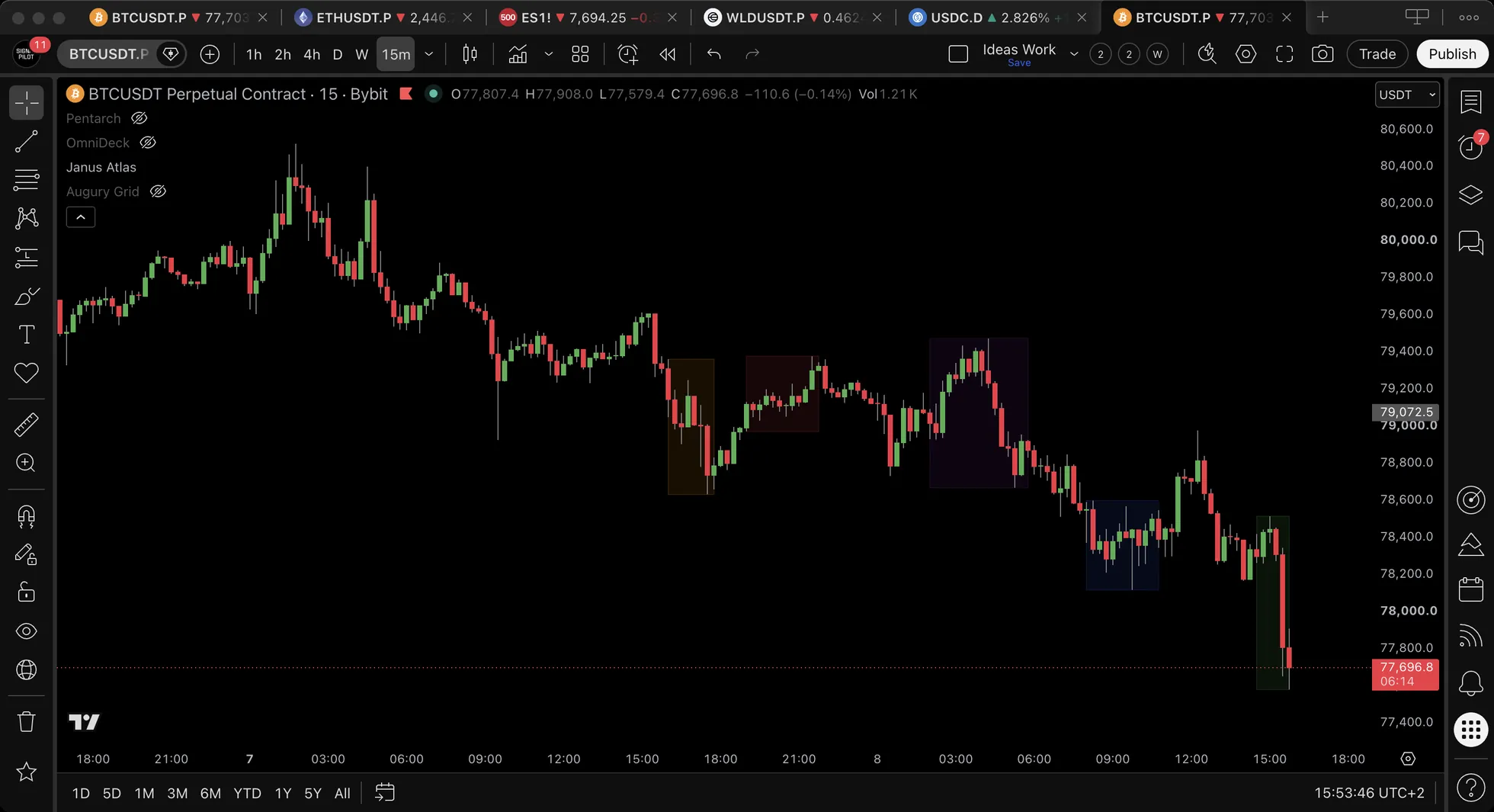
What it does: Highlights key market windows with visual background shading. These are time periods when market participants are most active.
Available Killzones:
| Killzone | Default Time (ET) | Description |
|---|---|---|
| Asian | 20:00-00:00 | On by default. Tokyo and Sydney overlap |
| London Open | 02:00-05:00 | On by default. European open |
| NY Open | 08:30-11:00 | On by default. US open |
| London Cls | 10:00-12:00 | Off by default. European close |
| NY PM | 13:00-16:00 | Off by default. US afternoon |
Visual Display: Semi-transparent background shading during active killzone periods.
Interpretation:
- Killzones highlight periods of highest market activity
- Level tests during high-activity windows show stronger reactions
- Combine with session levels for confluence
Note: Killzones are purely visual time-based aids. They have no alerts since there's no price level to "touch."
🎯 Custom Sessions
What it does: Define your own custom time windows with automatic High/Low/Open/Close tracking.
What Displays:
- cs1H/cs1L - Custom Session 1 High/Low
- cs2H/cs2L - Custom Session 2 High/Low
Configuration per session:
- Enable/Disable toggle
- Custom name (appears on labels)
- Start time (hour:minute)
- End time (hour:minute)
- Color customization
Use cases:
- Track your local market hours
- Monitor specific market windows (e.g., futures open)
- Create custom "power hours" tracking
📊 Gap Levels
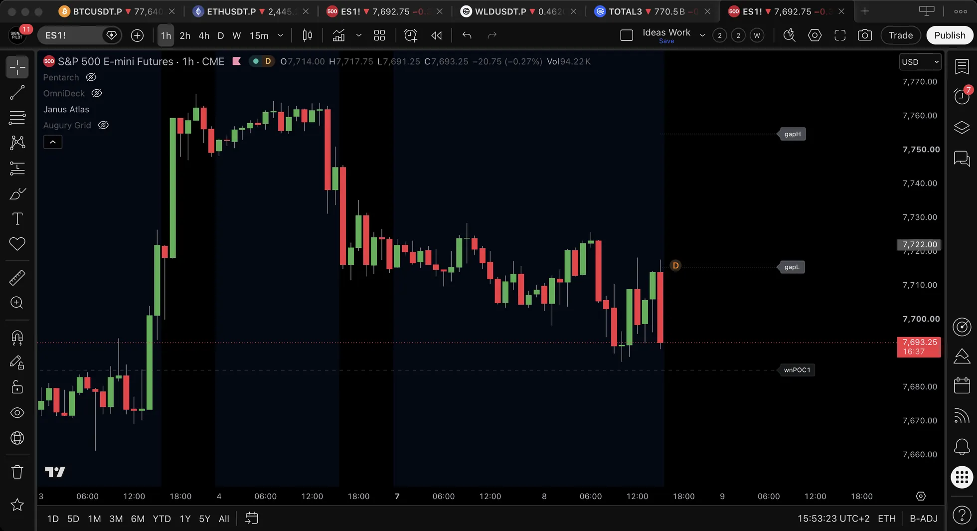
What it does: Automatically detects and displays price gaps between sessions.
What Displays:
- gapH - Gap High (top of gap)
- gapL - Gap Low (bottom of gap)
Gap Detection:
- Daily gaps (overnight gaps)
- Weekend gaps (Friday close to Sunday open)
- Gap fill tracking (optional visual when gap fills)
How to use:
- Gaps often act as magnets (price tends to fill gaps)
- Unfilled gaps = potential future targets
- Gap edges (gapH/gapL) act as support/resistance
On gap fills: a gap is a price range nobody traded through, which makes it a plausible target. How often gaps fill, and how quickly, varies by market and by what caused the gap. The indicator does not measure that, so do not carry an assumed rate into it.
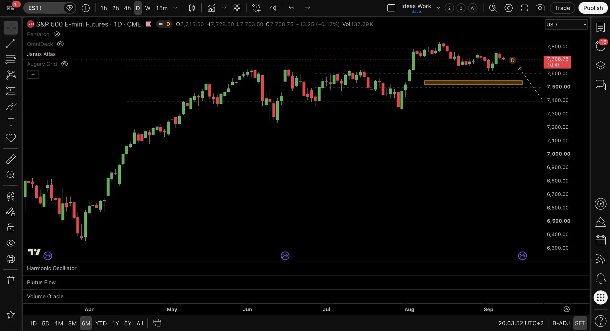
📊 CME Gaps
What it does: Tracks weekend price gaps from CME futures markets. CME closes Friday 4pm CT and reopens Sunday 5pm CT, and the price difference creates a "gap" that often gets filled.
What Displays:
- Box mode: Shaded rectangle from gap low to gap high
- Lines mode: Two dashed horizontal lines at gap boundaries
Configuration:
| Setting | Options | Default | Description |
|---|---|---|---|
| CME Gaps | On/Off | Off | Master toggle (in Controls group) |
| Auto-Detect Symbol | On/Off | On | Automatically matches chart to CME symbol |
| Manual Symbol | 22 presets | BTC1! | Only used when Auto-Detect is OFF |
| Display Style | Box / Lines | Box | Shaded zone or dashed lines |
| Max Gaps | 1-50 | 2 | How many unfilled gaps to show |
| Gap Color | Color picker | Orange | Gap zone color |
| Box Transparency | 0-95 | 70 | Box fill opacity |
Auto-Detection Mapping:
When Auto-Detect is ON, the indicator automatically maps your chart to the correct CME symbol:
| Your Chart Contains | CME Symbol Used |
|---|---|
| BTC, BTCUSDT, XBT | CME:BTC1! |
| ETH, ETHUSDT | CME:ETH1! |
| SPY, SPX, ES | CME_MINI:ES1! |
| QQQ, NDX, NQ | CME_MINI:NQ1! |
| DIA, DJI, YM | CBOT_MINI:YM1! |
| IWM, RUT, RTY | CME_MINI:RTY1! |
| XAUUSD, GOLD, GC, GLD | COMEX:GC1! |
| XAGUSD, SILVER, SLV | COMEX:SI1! |
| OIL, WTI, CL, USO | NYMEX:CL1! |
| NATGAS, NG, UNG | NYMEX:NG1! |
| EURUSD, 6E | CME:6E1! |
| USDJPY, 6J | CME:6J1! |
| DXY, DX | ICEUS:DX1! |
| COPPER, HG | COMEX:HG1! |
| CORN, ZC | CBOT:ZC1! |
| SOYBEAN, ZS | CBOT:ZS1! |
| WHEAT, ZW | CBOT:ZW1! |
Behavior When No Match Found:
If Auto-Detect is ON and your chart symbol doesn't match any CME product (e.g., TSLA, AAPL, random altcoins), CME Gaps will not display: no boxes, no lines. This prevents showing irrelevant gaps on unrelated charts.
Characteristics:
- Gaps often act as price magnets (tend to get filled)
- Gap up = bullish gap (Sunday opened higher than Friday close)
- Gap down = bearish gap (Sunday opened lower than Friday close)
- Gaps auto-remove when price fills them completely
- Works on ALL chart timeframes (fetches CME weekly data internally)
How to use:
- Unfilled gaps = potential future price targets
- Gap edges act as support/resistance zones
- Multiple unfilled gaps at similar levels = stronger magnet effect
- Use with other Janus levels for confluence
Example: BTC gaps up $1,400 over the weekend (Friday close $92,000 → Sunday open $93,400). Gap zone displays from $92,000-$93,400. Price rallies to $95,000 then pulls back → watch for reaction at gap zone.
FAQ:
- Why don't I see CME gaps on my chart? With Auto-Detect ON (default), CME Gaps only display when your chart matches a supported CME product. Stocks like TSLA, AAPL, or altcoins like DOGE don't have CME futures, so no gaps appear. If you want to see BTC CME gaps on an unrelated chart, turn Auto-Detect OFF and manually select BTC1!.
⚠️ Chart Scaling Note
More gaps = chart squeeze. Historical gaps far from current price will auto-scale your chart. Start with 1-2 gaps, increase if needed.
📊 Fair Value Gaps (FVG)
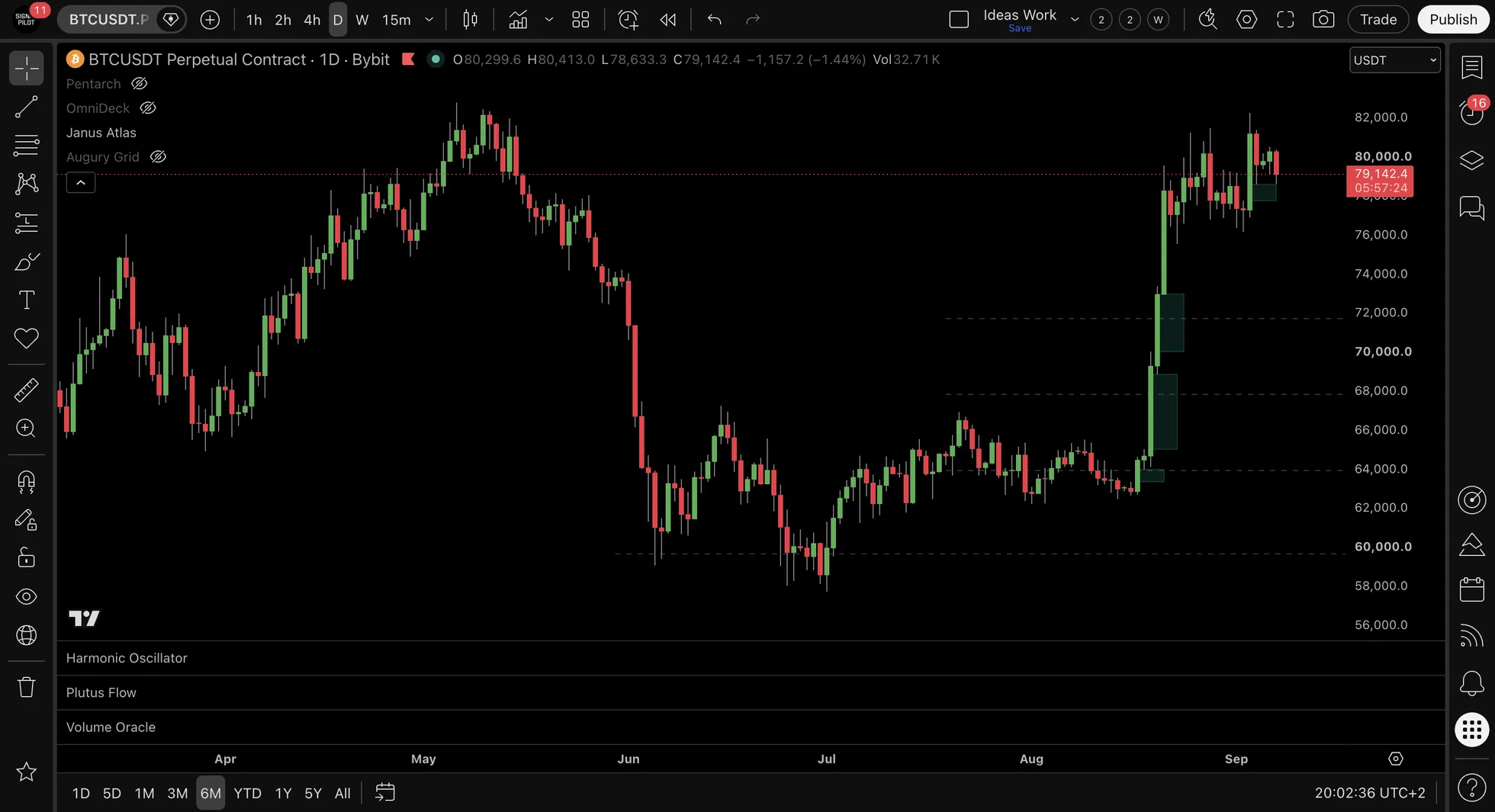
What it does: Detects price imbalances where market moved so fast it left a "gap" between non-adjacent candles.
What Displays:
- Semi-transparent boxes highlighting price imbalances
- Colors change based on position relative to current price
- Green zones = Demand (FVG below price)
- Red zones = Supply (FVG above price)
| FVG Type | Detection Logic |
|---|---|
| Bullish FVG | Gap up where candle low > candle[2] high (demand zone) |
| Bearish FVG | Gap down where candle high < candle[2] low (supply zone) |
Configuration:
| Setting | Options | Default |
|---|---|---|
| Bullish FVG | On/Off | On |
| Bearish FVG | On/Off | On |
| Max FVGs | 1-50 | 10 |
| Show | All / Unmitigated | Unmitigated |
| Mitigation | Wick / Close | Wick |
| Extend Right | On/Off | On |
| Demand Color | Color picker | Green (80%) |
| Supply Color | Color picker | Red (80%) |
| Mitigated Color | Color picker | Gray (70%) |
Key Features:
1. Position-based coloring:
- FVG below current price = Green (demand/support zone)
- FVG above current price = Red (supply/resistance zone)
- Colors update dynamically as price moves
2. Auto lookback by timeframe:
| Timeframe | Lookback |
|---|---|
| 1m - 15m | 2 days |
| 30m - 1H | 1 week |
| 2H - 4H | 2 weeks |
| Daily | 1 month |
| Weekly | 3 months |
| Monthly | 6 months |
3. Mitigation modes:
- Wick = FVG mitigated when any wick touches the gap
- Close = FVG mitigated when candle closes inside the gap (stricter)
Interpretation:
- FVGs are "magnets" – price tends to return to fill imbalances
- Unmitigated FVGs = potential reaction zones
- Green FVG below = demand zone / support
- Red FVG above = supply zone / resistance
Example: ES futures gaps up leaving a bullish FVG between 4,480-4,490. Price rallies to 4,520 then pulls back → Watch for bounce at 4,480-4,490 FVG zone (demand).
🎯 Confluence Zones
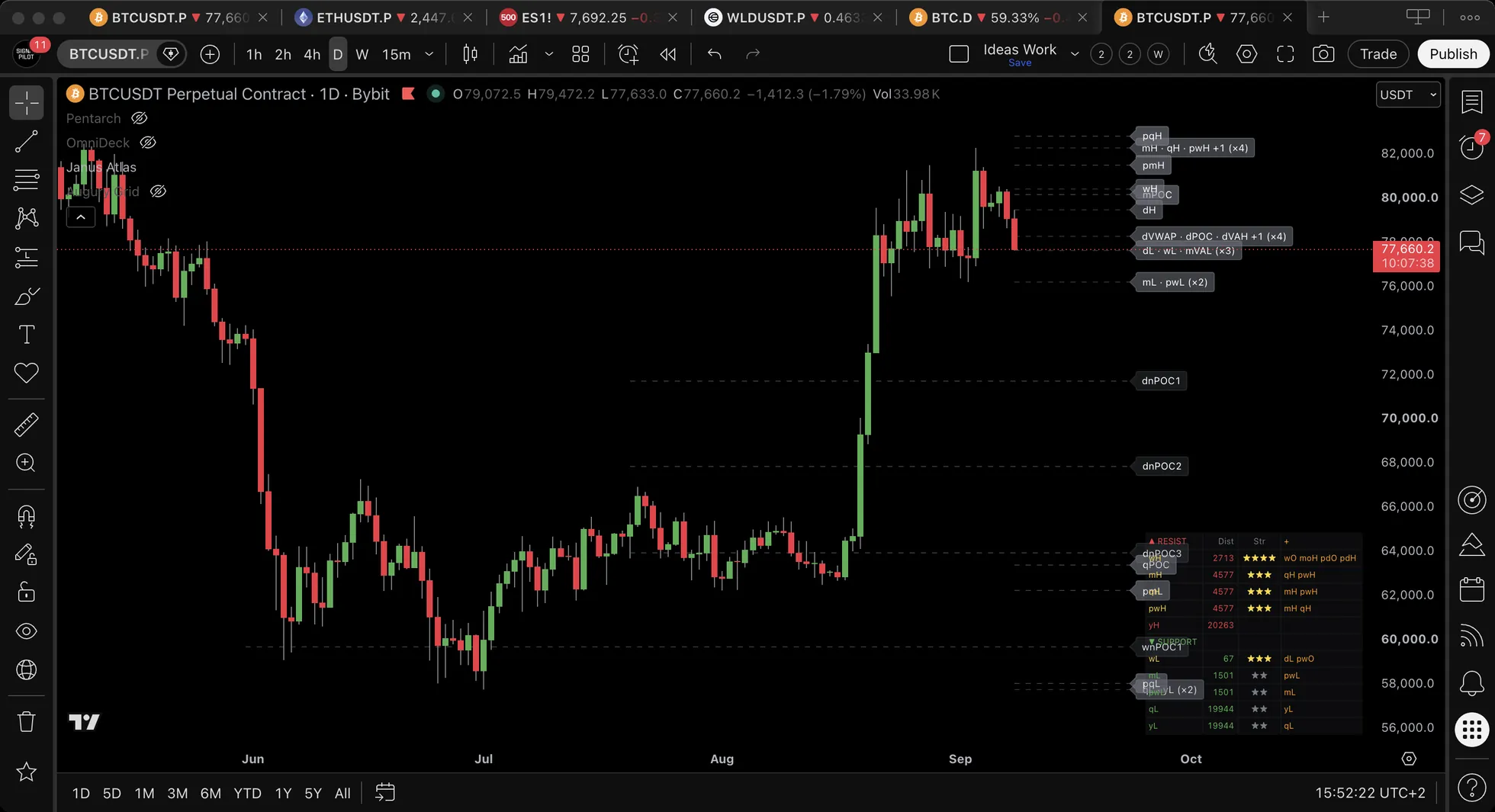
What it does: Automatically detects when multiple levels cluster within a tight price range, marking where the levels agree, with a combined label naming which families landed there.
The combined label:
When multiple levels cluster at the same price, Janus Atlas now displays them as a single combined label:
dH · wH · pdH (×3)
Label Format Explained:
- Level names separated by · (middle dot):
dH · wH · pdH - (×N) suffix shows how many systems agree on that price zone:
(×2)= 2 levels clustered(×3)= 3 levels clustered(×4)= 4 levels clustered (very strong)
How it works:
- Scans all enabled levels for proximity
- When 2+ levels cluster within threshold → Combined into single label
- Label shows all contributing level names
- (×N) count indicates zone strength at a glance
Configuration:
| Setting | Description | Default |
|---|---|---|
| Enable Zones | Turn feature on/off | On |
| Min Levels | Minimum levels to form zone | 2 |
| Proximity % | How close levels must be | 0.5% |
| Zone Color | Highlight color | Purple |
| Show Label | Display combined label on zone | On |
Why it matters:
- A single level is one calculation naming a price
(×2)means two name it, worked out from different inputs(×3)means three, and so on- The count tells you how many independent reasons exist for orders to sit there. It does not tell you they will hold.
Example: Daily High + Weekly High + Previous Day High all within 0.3% = Combined label showing dH · wH · pdH (×3)
📋 Distance Table
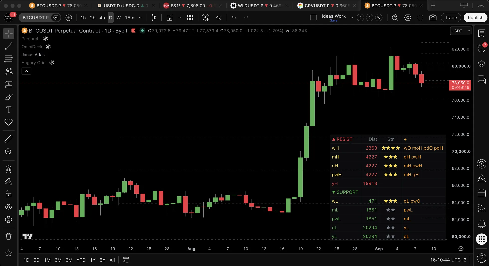
What it does: Displays a real-time table showing distance from current price to key levels, split into resistance (above) and support (below) sections with confluence strength indicators.
How the table is laid out:
▲ RESISTANCE (levels above current price)
| dH | 0.3% | ★★★ | +wH, pdH |
| wH | 0.8% | ★★ | +mH |
▼ SUPPORT (levels below current price)
| dL | 0.2% | ★★★★ | +POC, VWAP |
| wL | 1.1% | ★ |
Table Columns:
| Column | Description |
|---|---|
| Level | Level name/abbreviation (color-coded: red = resistance, green = support) |
| Dist | Distance from current price (% or points/ticks) |
| Str | Confluence strength shown as stars (★). Stars show total confluence: both enabled AND hidden levels combined |
| + | Hidden level names that would add confluence if enabled (shown in orange) |
Star Rating System:
- Blank = a single level, with nothing else near it
- ★★ = exactly two levels clustered
- ★★★ = exactly three, and the row turns yellow from here up
- ★★★★ = four or more. The count stops at four stars, so a five-level cluster and a four-level one look the same
Hidden Confluence Discovery:
The + column is a powerful feature that scans 60+ level types (HTF, Sessions, VWAP, Fib, Previous Periods, etc.) and shows which disabled levels would add confluence to that zone. This lets you see the true zone strength before enabling additional features.
💡 Key Insight
"Stars show true zone strength. The + column tells you what to enable."
Configuration:
| Setting | Options | Default |
|---|---|---|
| Position | 8 corners and centres, from Top Left to Bottom Center | Bottom Right |
| Layout | Vertical, Compact | Vertical |
| Columns (Horiz) | 2 to 8 | 4 |
| Text Size | Tiny, Small, Normal | Tiny |
| Levels Shown | 1 to 24 | 12 |
| Show As | Price, Ticks, % | Price |
| Show Header | On/Off | On |
| Show Strength | On/Off | On |
| Show Confluence Details | On/Off | On |
📱 Mobile Tip: Use Compact + Bottom Center + Tiny + Header Off for best mobile experience.
Interpretation:
- Look for ★★★+ zones: these are where the most systems agree
- Check the + column to discover hidden confluence you might be missing
- Enable levels shown in + column to add visual confirmation on chart
- Focus on zones where multiple timeframes agree (e.g., dH + wH + mH)
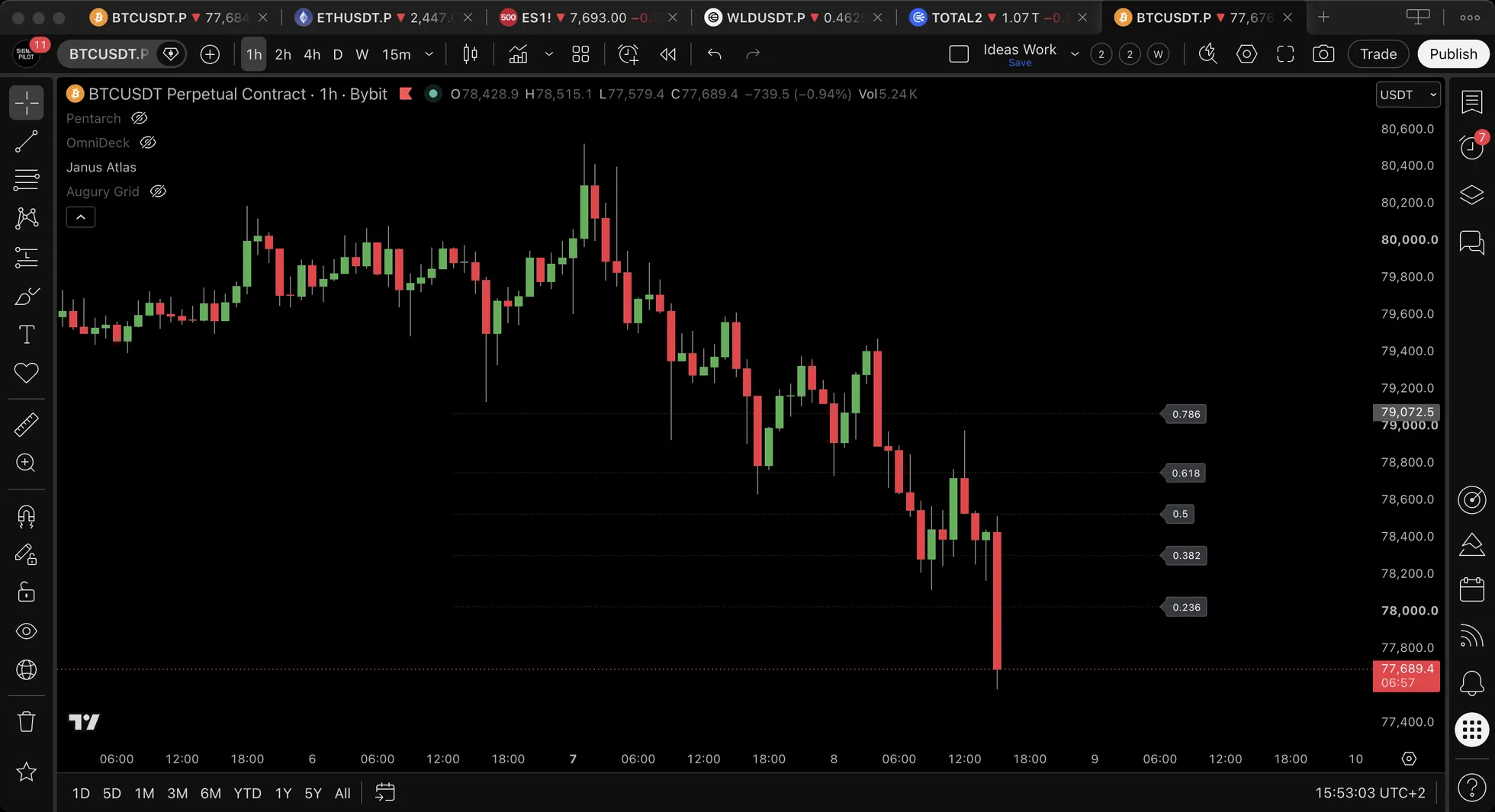
📐 Fibonacci Levels
What it does: Auto-draws Fibonacci retracement levels from any anchor high/low point, helping identify potential support and resistance zones based on the golden ratio.
Key Features:
- 2 Independent Fib Sets - Display two anchors simultaneously (e.g., Daily + Weekly) with different colors
- 20 Anchor Options - Far more than just Daily H/L (including Prev Year H/L)
- 8 Fib Levels - 6 retracements (0.236-0.886) + 2 extensions (1.272, 1.618)
- 1 Grouped Alert - "Fib Level Touched" fires when ANY fib level is touched
Anchor Options (20 in total):
| Category | Options |
|---|---|
| Current Period | Daily, Weekly, Monthly, Quarterly, Yearly H/L |
| Previous Period | Prev Day, Prev Week, Prev Month, Prev Quarter, Prev Year H/L |
| Day-Specific | Monday, Wednesday, Friday H/L |
| Sessions | Asian, Euro, NY Session H/L |
| Custom/Other | Opening Range, Custom Session 1, Custom Session 2, Gap H/L |
Configuration:
| Level | Type | Default | Purpose |
|---|---|---|---|
| 0.236 | Retracement | On | Shallow pullback |
| 0.382 | Retracement | On | Standard pullback |
| 0.5 | Retracement | On | Mid-range |
| 0.618 | Retracement | On | Golden ratio |
| 0.786 | Retracement | On | Deep pullback |
| 0.886 | Retracement | Off | Very deep pullback |
| 1.272 | Extension | Off | First profit target |
| 1.618 | Extension | Off | Golden target |
Retracements vs Extensions:
- Retracements (0.236-0.886) = INSIDE the range – zones where pullbacks may find support
- Extensions (1.272, 1.618) = OUTSIDE the range – potential continuation targets
Most Important Levels: 0.382, 0.5, 0.618 (golden ratio levels), 1.618 (golden extension)
Interpretation:
- Enable Fib Set 1 with Daily H/L anchor for intraday retracement zones
- Add Fib Set 2 with Weekly H/L for multi-timeframe confluence
- Watch for price reactions at 0.382, 0.5, and 0.618 levels
- 1.272 and 1.618 extensions mark potential continuation targets
- Combine with other Janus levels for confluence
Pro tip: Use Fib Set 1 for retracements (0.236-0.886) and Fib Set 2 for extensions (1.272, 1.618 only) with different anchors.
FAQ:
- Why one grouped alert? TradingView's 64-alert limit per indicator. A grouped alert covers all fib levels efficiently.
- Can I show two anchors at once? Yes! Use Fib Set 1 + Fib Set 2 with different anchors and colors.
- Most important levels? 0.382, 0.5 and 0.618 are the ones most participants draw, which is the whole of why they matter.
- What's the difference between retracements and extensions? Retracements (0.236-0.886) are INSIDE the range for entries. Extensions (1.272, 1.618) are OUTSIDE the range for profit targets.
- Why are extensions off by default? Retracements are most commonly used. Extensions add lines that may clutter the chart for those not using them.
⚓ Anchored VWAP (New in v1.1)
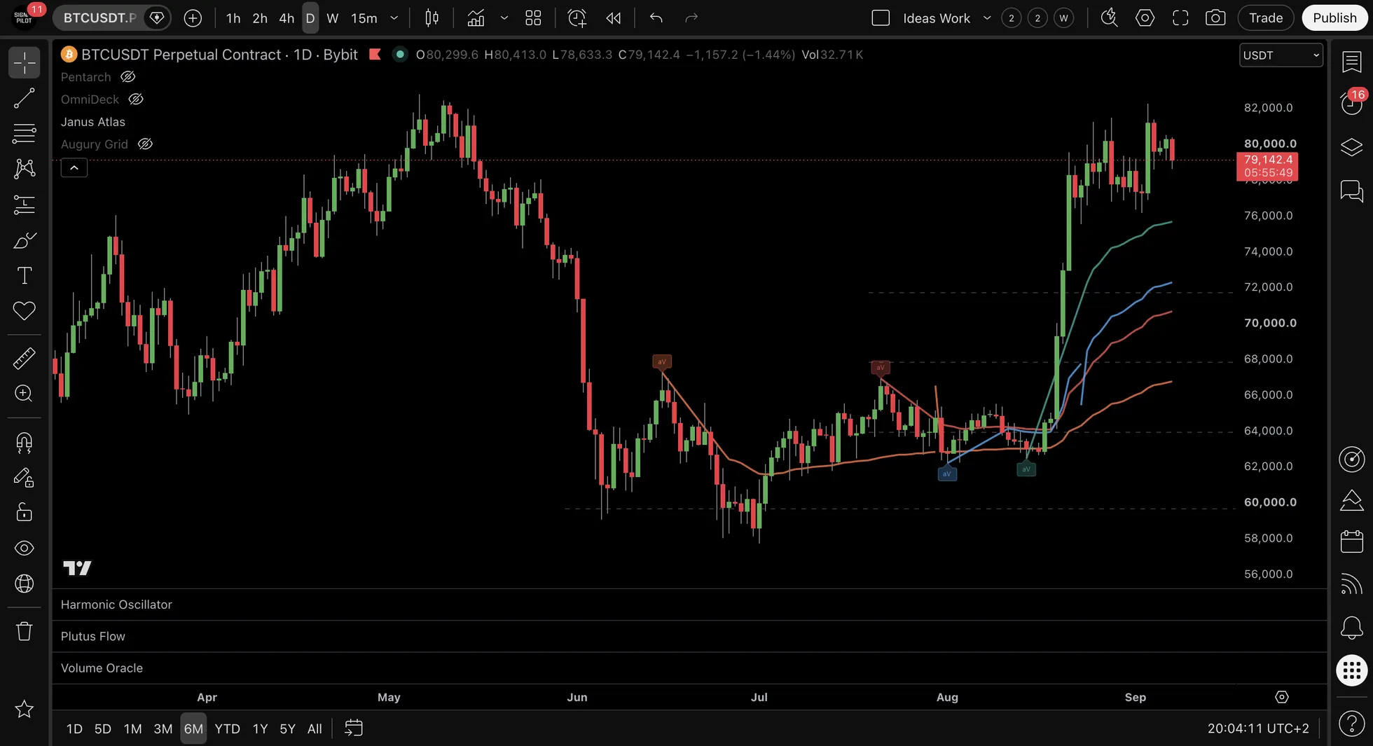
What it does: Draws Volume-Weighted Average Price lines anchored to specific pivot points or user-defined dates, providing dynamic support/resistance levels based on volume-weighted price action from key turning points.
📚 Why Anchored VWAP?
Standard VWAP resets each session. Anchored VWAP lets you measure volume-weighted price from any significant point: an earnings gap, a swing low, a breakout bar. This reveals where participants who entered at that event are positioned on average, creating dynamic levels that standard VWAP cannot provide.
Key Features:
- Auto and manual in one place : detection finds the pivots for you, the manual slots let you anchor anywhere you like
- 8 simultaneous AVWAP lines : 4 auto-detected + 4 manual anchor slots
- Non-repainting : All signals confirm on bar close
- 6 total alerts : 2 auto (Swing Low, Swing High) + 4 manual anchor alerts
Auto-Detected Anchors (4 lines)
Automatically detects swing high and swing low pivots and draws AVWAP from each detected pivot forward. Maintains the 2 most recent bull pivots (swing lows) and 2 most recent bear pivots (swing highs).
Auto Anchor Colors:
| Anchor | Type | Color | Hex |
|---|---|---|---|
| Swing Low 1 (recent) | Bull pivot | Teal | #26a69a |
| Swing Low 2 (older) | Bull pivot | Blue | #42A5F5 |
| Swing High 1 (recent) | Bear pivot | Red | #ef5350 |
| Swing High 2 (older) | Bear pivot | Orange | #FF7043 |
Auto-recoloring: When a new pivot is detected, the previous "recent" line automatically shifts to the "older" color (e.g., Swing Low 1 Teal → Swing Low 2 Blue).
Pivot sensitivity auto-adjusts by timeframe:
| Timeframe | Pivot Length (bars) |
|---|---|
| 1 minute | 50 |
| 5 minute | 30 |
| 15 minute | 20 |
| 1 hour | 15 |
| Daily | 10 |
Manual Anchor Slots (4 slots)
4 independent manual anchor slots, each with full control. No drawing tools needed: use the calendar date/time picker in TradingView settings to select your anchor point.
Each manual slot provides:
- Enable/disable toggle
- Date/Time picker (calendar UI in TradingView settings)
- Type selector: "Swing High" or "Swing Low"
- Custom color picker
- Independent alert
Default Manual Anchor Colors:
| Slot | Color | Hex |
|---|---|---|
| Slot 1 | Silver | #E0E0E0 |
| Slot 2 | Purple | #AB47BC |
| Slot 3 | Lime Green | #7CB342 |
| Slot 4 | Yellow | #FDD835 |
How it works: Pick a date/time, the script finds that bar and anchors AVWAP from that exact point. Lines are drawn as polylines (single drawing object from anchor to current bar).
AVWAP Settings (Input Group 18)
| Setting | Description | Default |
|---|---|---|
| Auto AVWAP | Toggle auto-detection of pivot anchors (manual slots work independently) | On |
| Auto Timeframe | Use automatic pivot sensitivity per timeframe | On |
| Manual Pivot Length | Override pivot sensitivity when Auto Timeframe is off | — |
| Show Anchor Markers | Display "aV" labels at each anchor point | On |
| Line Width | Width for all AVWAP lines (auto + manual) | 2 |
| Manual Slot 1–4 | Enable, Date/Time, Type (Swing High/Low), Color | Off |
Anchor Marker Tooltips:
- Auto anchors: Show pivot type and whether it's the recent or older anchor
- Manual anchors: Show "Manual AVWAP (user-defined)" + type + price at anchor
Interpretation:
- Use auto AVWAP to track where volume-weighted price sits relative to recent swing pivots
- Add manual anchors at key events: earnings gaps, major breakouts, significant lows
- When price approaches an AVWAP line, watch for reactions (bounce, break, or stall)
- Multiple AVWAP lines clustering at the same price zone create high-confluence areas
- Combine with other Janus Atlas levels for additional confirmation
Pro tip: Manual anchors work independently from the auto AVWAP toggle. You can disable auto-detection while keeping your manual anchors active, or vice versa.
🔄 Level Reaction Patterns
Common Patterns Observed:
Pattern 1: Bounce (Support/Resistance)
Price approaches level → Reversal occurs
Interpretation: Support (bounce up) or Resistance (bounce down)
Example: Price declines to Weekly Low → Bounce to upside observed.
Pattern 2: Break (Continuation)
Price approaches level → Penetrates through → Continues direction
Interpretation: Level broken, continuation pattern
Example: Price breaks above Daily High → Continues upward momentum.
Pattern 3: Retest After Break
Price breaks level → Pulls back to test level → Continues original direction
Interpretation: Break confirmation, retest pattern
Example: Price breaks $100 level → Pulls back to $100 → Continues higher.
Pattern 4: Cluster Zone (Multiple Levels)
Multiple levels converge → Enhanced reaction characteristics
Interpretation: High confluence zone, stronger reactions observed
Example: Weekly Low + VWAP + POC at $65,000 → Strong support characteristics at zone.
Patterns provide context for level interactions. Individual interpretation varies.
🎯 Level Usage by Timeframe
For Short-Term Analysis (5m-15m charts):
Recommended Levels:
- ✓ Session levels (Asian/Euro/NA)
- ✓ Daily VWAP
- ✓ Daily High/Low
- ✓ POC/VAH/VAL
- ✓ Market structure
Rationale: Intraday levels relevant for short-term analysis.
For Intraday Analysis (1H-4H charts):
Recommended Levels:
- ✓ Daily + Weekly levels
- ✓ Daily + Weekly VWAP
- ✓ POC/VAH/VAL
- ✓ Market structure
- ✓ Previous day levels
Rationale: Combination of intraday and multi-day levels.
For Multi-Day Analysis (Daily charts):
Recommended Levels:
- ✓ Weekly + Monthly levels
- ✓ Weekly + Monthly VWAP
- ✓ Market structure
- ✓ Quarterly levels
- ✗ Session levels (too granular)
Rationale: Higher timeframe levels match multi-day analysis periods.
Level selection varies based on individual approach and timeframe.
Remember: Match level timeframes to your analysis period: short-term analysis uses session levels, intraday analysis uses daily levels, multi-day analysis uses weekly/monthly. Using mismatched levels (daily levels on a 1-minute chart) creates noise and reduces effectiveness.
🔔 Alert Configuration (58 Alerts)
Janus Atlas provides 58 selectable alerts in three groups: 38 individual alerts for specific high-interest levels, 14 grouped alerts that each cover a family of context levels, and 6 Anchored VWAP alerts : 2 for the auto-detected pivots and 4 for the manual anchor slots. That still leaves room under TradingView’s 64-alert ceiling.
Individual Alerts (38)
Specific high-interest levels. Each fires for one exact level.
Previous Day (3)
| Alert Name | Trigger |
|---|---|
pdO • Prev Day Open | Previous Day Open Touched |
pdH • Prev Day High | Previous Day High Touched |
pdL • Prev Day Low | Previous Day Low Touched |
Daily (3)
| Alert Name | Trigger |
|---|---|
dO • Daily Open | Daily Open Touched |
dH • Daily High | Daily High Touched |
dL • Daily Low | Daily Low Touched |
Weekly (3)
| Alert Name | Trigger |
|---|---|
wO • Weekly Open | Weekly Open Touched |
wH • Weekly High | Weekly High Touched |
wL • Weekly Low | Weekly Low Touched |
Monday (3)
| Alert Name | Trigger |
|---|---|
moO • Monday Open | Monday Open Touched |
moH • Monday High | Monday High Touched |
moL • Monday Low | Monday Low Touched |
Opening Range (2)
| Alert Name | Trigger |
|---|---|
orH • OR High | Opening Range High Touched |
orL • OR Low | Opening Range Low Touched |
VWAP (3)
| Alert Name | Trigger |
|---|---|
dVWAP • Daily VWAP | Daily VWAP Touched |
wVWAP • Weekly VWAP | Weekly VWAP Touched |
pdVWAP • Prev Day VWAP | Previous Day VWAP Touched |
Daily Volume Profile (3)
| Alert Name | Trigger |
|---|---|
dPOC • Daily POC | Daily POC Touched |
dVAH • Daily VAH | Daily VAH Touched |
dVAL • Daily VAL | Daily VAL Touched |
Weekly Volume Profile (3)
| Alert Name | Trigger |
|---|---|
wPOC • Weekly POC | Weekly POC Touched |
wVAH • Weekly VAH | Weekly VAH Touched |
wVAL • Weekly VAL | Weekly VAL Touched |
Gap (3)
| Alert Name | Trigger |
|---|---|
gapH • Gap High | Gap High Touched |
gapL • Gap Low | Gap Low Touched |
Gap Filled | Gap Has Been Filled |
CME Gaps (2)
| Alert Name | Trigger |
|---|---|
CME Gap • New | New CME weekend gap detected |
CME Gap • Filled | CME gap has been filled |
Market Structure (4)
| Alert Name | Trigger |
|---|---|
CHoCH • Bullish | Bullish Change of Character Detected |
CHoCH • Bearish | Bearish Change of Character Detected |
BOS • Bullish | Bullish Break of Structure Detected |
BOS • Bearish | Bearish Break of Structure Detected |
FVG (2)
| Alert Name | Trigger |
|---|---|
FVG • Bullish | Bullish Fair Value Gap Detected |
FVG • Bearish | Bearish Fair Value Gap Detected |
Other (2)
| Alert Name | Trigger |
|---|---|
Fib Level Touched | Any Enabled Fib Level Touched |
Confluence Zone | Confluence Zone Detected (as many levels as Min Levels asks for, 2 by default) |
Naked POC (2)
| Alert Name | Trigger |
|---|---|
dnPOC • Daily Naked POC | Daily Naked POC Touched |
wnPOC • Weekly Naked POC | Weekly Naked POC Touched |
Grouped Alerts (14)
Context levels grouped by category. One alert covers multiple related levels.
| Alert Name | Covers |
|---|---|
Monthly (mO, mH, mL) | Monthly Open, High, Low |
Quarterly (qO, qH, qL) | Quarterly Open, High, Low |
Yearly (yO, yH, yL) | Yearly Open, High, Low |
Sessions (Asia/Euro/NY O/H/L) | All 9 session levels |
Custom Sessions (CS1/CS2 H/L) | CS1 H/L, CS2 H/L |
Prev Week (pwO, pwH, pwL) | Previous Week O/H/L |
Prev Month (pmO, pmH, pmL) | Previous Month O/H/L |
Prev Quarter (pqO, pqH, pqL) | Previous Quarter O/H/L |
Prev Year (pyO, pyH, pyL) | Previous Year O/H/L |
HTF VWAP (mVWAP, qVWAP, yVWAP) | Monthly, Quarterly, Yearly VWAP |
Prev VWAP (pwVWAP, pmVWAP, pqVWAP, pyVWAP) | All previous period VWAPs |
Monthly VP (mPOC, mVAH, mVAL) | Monthly POC, VAH, VAL |
Quarterly VP (qPOC, qVAH, qVAL) | Quarterly POC, VAH, VAL |
Yearly VP (yPOC, yVAH, yVAL) | Yearly POC, VAH, VAL |
Note: Grouped alerts fire when ANY level in that category is touched.
Anchored VWAP Alerts (4 new in v1.1 + 2 existing auto)
Alerts for Anchored VWAP lines. Auto alerts cover the auto-detected pivot anchors; manual alerts fire for each user-defined anchor slot independently.
Auto AVWAP (2: existing, unchanged)
| Alert Name | Trigger |
|---|---|
aVWAP - Swing Low | Price touches any auto bull AVWAP anchor (2 most recent swing lows) |
aVWAP - Swing High | Price touches any auto bear AVWAP anchor (2 most recent swing highs) |
Manual AVWAP (4: new in v1.1)
| Alert Name | Trigger |
|---|---|
aVWAP - Manual Anchor 1 | Price touches Manual AVWAP Anchor 1 |
aVWAP - Manual Anchor 2 | Price touches Manual AVWAP Anchor 2 |
aVWAP - Manual Anchor 3 | Price touches Manual AVWAP Anchor 3 |
aVWAP - Manual Anchor 4 | Price touches Manual AVWAP Anchor 4 |
Note: Manual anchor alerts work independently from the auto AVWAP toggle. Each manual slot has its own enable/disable toggle, so alerts only fire for enabled slots.
Finding Alert Info
Hover over any toggle in Controls to see what alerts that feature provides via tooltip.
Alert Setup
- Right-click on chart → "Add Alert"
- Condition: Select "SP: Janus Atlas"
- Choose alert from dropdown:
- Individual alerts (e.g.,
pdH • Prev Day High) for specific levels - Grouped alerts (e.g.,
Monthly (mO, mH, mL)) for category coverage
- Individual alerts (e.g.,
- Configure notification method (popup, email, webhook, mobile)
- Create alert
Note: Killzones do NOT have alerts - they are purely visual time-based aids.
🔗 Integration with Other Indicators
While Janus Atlas draws support and resistance levels on its own, reading it alongside the other Signal Pilot indicators gives a reading more than one source. Here is how they are commonly read together:
Janus Atlas + Pentarch (Timing at Levels)
Workflow:
- Enable key Janus levels → Focus on Daily/Weekly levels, POC, VWAP, and key Fibonacci levels
- Wait for price to approach level → Monitor as price nears confluence zone (3+ levels clustering)
- Wait for a cycle event from Pentarch → a TD or IGN firing at that level means the timing agrees with the structure
- Expected outcome: Timing events that align with structural levels have stronger follow-through
Example: Price drops to Daily Low + Weekly Low + 0.618 Fib confluence → Pentarch TD event fires = strong bullish confluence
Janus Atlas + Volume Oracle (Level + Regime Confirmation)
Workflow:
- Price approaches major level → Watch Daily High, Weekly POC, or major Fibonacci level
- Check the regime in Volume Oracle as price reaches the level → accumulation, distribution or neutral?
- Regime confirms level significance: Accumulation regime at support = buying pressure. Distribution regime at resistance = selling pressure
- Expected outcome: Volume Oracle regime shows whether buyers or sellers are dominating at the level
Example: Price hits Daily Low → Volume Oracle shows Accumulation regime (green, 70%) → price bounces = confirmed volume support at level
Janus Atlas + Harmonic Oscillator (Momentum at Levels)
Workflow:
- Price reaches support level → Daily Low, Weekly Low, or POC zone
- Check the momentum read in Harmonic Oscillator → look for the state to turn, RANGING or TRENDING▼ giving way to TRENDING▲, with the vote count behind it rising
- Momentum + level alignment → Oscillator confirmation at key level increases reversal probability
- Expected outcome: Momentum shifts at structural levels = powerful confluence
Example: Price touches Weekly Low → the state in Harmonic Oscillator turns from TRENDING▼ to TRENDING▲ = the momentum read now agrees with the level
Janus Atlas + Plutus Flow (Flow at Levels)
Workflow:
- Price approaches resistance level → Daily High, Weekly High, or Fibonacci extension
- Look for a divergence in Plutus Flow → price making higher highs while OBV makes lower highs is a bearish divergence at resistance
- Level + divergence = high-confluence reversal zone → Structural resistance + money flow weakness = bearish confluence
- Expected outcome: A divergence landing on a level rather than in open space: two instruments describing one bar
Example: Price hits Weekly High + 1.618 Fib → Plutus Flow shows bearish divergence = strong reversal confluence
Pro Tip: The Level Confluence Workflow
Take the levels from Janus Atlas, the timing from Pentarch and the regime confirmation from Volume Oracle. Look for three or more Janus levels clustering in one zone, wait for a cycle event, then check that the regime agrees: accumulation for a bullish read, distribution for a bearish one. Three independent systems having to line up is a strict filter, which is the point of it.
See also: Analysis Workflow Guide for detailed multi-indicator approaches.
📝 Input Tooltips Reference
Hover over these inputs in settings to see helpful descriptions:
| Input | Tooltip Description |
|---|---|
| Killzones | Background shading for high-activity market windows |
| Distance Table | Shows nearest levels above/below current price |
| Show Price on Labels | Append price to level labels (e.g. 'dH • 88500') |
| Label Spacing | Vertical offset between stacked labels |
| VP Resolution | Number of price bins for volume distribution |
| OR Duration | How long after session open to track the OR |
| Gap Min Size | Minimum gap size as % of price to display |
| Mark Gap Fill | Show visual indicator when price fills the gap |
| Confluence Min Levels | How many levels must cluster together |
| Confluence Proximity | Maximum distance between levels to be clustered |
| MS Pivot Lookback | Bars to look back for swing detection |
| MS Min Swing | Minimum swing size as % to qualify as structure |
| MS Swing Offset | Vertical offset for HH/HL/LH/LL labels |
| MS Break Offset | Vertical offset for BOS/CHoCH labels |
| FVG Max Count | Maximum number of FVG boxes to display |
| Table Levels | Number of nearest levels in distance table |
⚠️ Common Mistakes to Avoid
These mistakes are frequently made by new Janus Atlas users. Avoid them to improve your results:
Mistake #1: Enabling All 60+ Levels Immediately
The Problem: Turning on all 60+ levels creates a cluttered, unreadable chart. Too many lines = analysis paralysis and missed opportunities.
The Fix:
- Start with the same five the beginner section names: Daily High/Low, Weekly High/Low, VWAP, POC and Market Structure
- Add levels progressively based on what your strategy needs
- Use timeframe-appropriate levels (Daily chart → focus on Weekly/Monthly levels)
- Disable intraday levels if analyzing higher timeframes
Remember: Less is more. A clean chart with 5-7 key levels is far more actionable than 60+ overlapping lines.
Mistake #2: Treating All Levels as Equally Important
The Problem: Not all levels have equal significance. Daily and Weekly levels carry more weight than 15-minute levels. Treating them equally reduces effectiveness.
The Fix:
- Prioritize higher timeframe levels: Weekly High/Low > Daily High/Low > Intraday levels
- Monthly and Weekly levels are major structural zones
- POC (Point of Control) levels show highest volume areas = significant interest
- Fibonacci levels derived from major swings are stronger than minor swings
Remember: Higher timeframe levels = stronger reactions. Focus on Weekly/Daily for multi-day analysis, Daily/4H for intraday analysis.
Mistake #3: Ignoring Level Confluence (Clustering)
The Problem: Price touches something on nearly every bar. What separates one touch from another is how many families landed at that price: a single line and a three-family cluster are drawn the same way.
The Fix:
- Look for zones where 3+ levels cluster within 0.5-1% price range
- Example confluence: Daily Low + Weekly Low + 0.618 Fib + Daily VWAP
- The more levels clustering = stronger support/resistance zone
- Prioritize confluence zones over isolated single-level touches
Remember: a cluster is several independent calculations landing on the same price. That earns more attention than one line, and it is still not a promise.
Mistake #4: Assuming Levels Always Hold
The Problem: Support and resistance levels can break. Expecting holds without confirmation leads to false expectations.
The Fix:
- Wait for confirmation: price rejection (wick reversal), volume spike, or Pentarch event
- If level breaks on high volume, don't fight it → level becomes new support/resistance
- Use Harmonic Oscillator or Pentarch to confirm reversals at levels
- Account for the possibility of level breaks in your analysis
Remember: Levels are zones of interest, not absolute barriers. Always confirm with price action, volume, or momentum signals.
Mistake #5: Overloading with Fibonacci Levels
The Problem: Each Fib set carries 8 levels and two sets run at once, so enabling everything puts 16 lines on the chart. That clutters it and dilutes the levels that matter.
The Fix:
- Focus on key Fibonacci levels: 0.382, 0.5, 0.618 (retracements), 1.272, 1.618 (extensions)
- Disable minor Fib levels (0.236, 0.786) unless they align with other confluence
- Fibonacci retracements mark potential pullback reaction zones
- Fibonacci extensions mark potential continuation targets
Remember: The 0.618 retracement and 1.618 extension are the most significant Fibonacci levels. Start with these.
Mistake #6: Using Static Levels in Dynamic Markets
The Problem: Markets evolve. Yesterday's Daily High may be irrelevant today. Relying on outdated levels reduces effectiveness.
The Fix:
- Janus Atlas automatically updates Daily/Weekly/Monthly/Quarterly/Yearly levels → levels refresh with each new period
- Update Fibonacci swings regularly to reflect current market structure
- VWAP and POC levels recalculate dynamically → always current
- Review and adjust which levels are enabled weekly based on market conditions
Remember: Dynamic levels (VWAP, POC, Daily H/L) adapt to current conditions. Static levels (old Fibs) become stale.
Additional Resources
For more best practices, see Best Practices & Pro Tips. For workflow guidance, see Analysis Workflow Guide.
🌫️ When This Doesn't Work Well
Janus Atlas levels show reduced reliability in certain market conditions. Recognizing these environments helps set appropriate expectations:
Strong Momentum & Trending Markets
The Condition: During parabolic moves, momentum cascades, or panic selling, price momentum becomes so extreme that support/resistance levels get blown through without meaningful reactions.
What Happens: Price touches Daily High, Weekly VWAP, or Fibonacci resistance levels but barely pauses before continuing higher. Levels that normally produce multi-hour reversals only create 5-10 minute consolidations. Level-based analysis expectations are not met.
Context: Support and resistance work because enough market participants decide to buy/sell at those levels. During extraordinary momentum, FOMO (fear of missing out) or panic override rational level-based decision-making. Levels become "speed bumps" rather than "walls." To spot momentum overriding levels, watch for the climax patterns in Volume Oracle and the exhaustion events in Pentarch.
Major News, Gaps, & Catalyst Events
The Condition: Earnings surprises, Federal Reserve decisions, geopolitical shocks, or company-specific news cause price to gap through multiple levels overnight or intraday.
What Happens: Price opens 5-10% away from previous close, gapping through Daily Low, Weekly VWAP, and multiple Fibonacci levels without touching them. Levels that existed pre-gap become irrelevant post-gap as new price ranges establish.
Context: Janus Atlas plots levels based on price history, but it doesn't "know" about external catalysts. Gaps create discontinuities where price never actually trades at the plotted levels. After major gaps, levels need to be re-evaluated: old structure often becomes obsolete, and new structure (post-gap highs/lows) becomes relevant.
Extremely Low Volume & Illiquid Sessions
The Condition: During holidays, overnight sessions (especially in stocks/ETFs), or low-participation periods, volume drops to 10-20% of normal levels.
What Happens: Price may appear to "respect" levels by bouncing at Daily VWAP or POC, but moves are small and unreliable. Low volume means any small order can push price through levels that would normally hold. Follow-through after level touches becomes minimal.
Context: Support and resistance require participation: buyers defending support, sellers defending resistance. Without volume, levels lose their significance because there aren't enough participants to enforce them. This is why session levels (Asian/London/New York highs/lows) become critical: they mark where actual liquidity and participation exist. Use Volume Oracle to confirm when participation is sufficient for levels to be reliable.
Too Many Levels Enabled (Information Overload)
The Condition: User enables 20+ of the 60+ available levels simultaneously, creating a chart covered in horizontal lines.
What Happens: Price is always "at a level" because lines are spaced every 0.5-1%. Every price point looks significant, which means nothing is actually significant. Decision-making becomes impossible: every move looks like it should reverse at the next level.
Context: Janus Atlas provides 60+ levels because different users need different tools for different approaches, not because everyone should display all of them simultaneously. The most effective approach: enable 5-8 levels most relevant to your timeframe and methodology. More levels don't provide more insight: they provide more confusion. Quality of levels matters more than quantity.
Mismatched Timeframes & Level Selection
The Condition: Using high-timeframe levels on low-timeframe charts, or vice versa. Example: watching Monthly High/Low on a 1-minute chart, or session levels on a weekly chart.
What Happens:
- Monthly levels on 1m charts: Levels are too far away to be relevant. Price may not reach them for days/weeks. Meanwhile, missing all the intraday session levels where actual opportunities exist.
- Session levels on weekly charts: Levels are so granular they become noise. Asian High from 3 weeks ago is irrelevant to a swing trader holding for months.
Context: Match level timeframes to your analysis timeframe. Short-term analysis (1m-15m): focus on session levels (AH, AL, EH, EL, NAH, NAL), Daily VWAP, POC. Intraday analysis (15m-1H): Daily/Weekly highs/lows, Daily VWAP, key Fibs. Multi-day analysis (4H-Daily): Weekly/Monthly levels, major Fibonacci retracements/extensions. Using mismatched levels creates noise and missed patterns.
Isolated Levels Without Confluence or Confirmation
The Condition: Expecting reactions at every single-level touch without requiring confluence (multiple levels clustering) or confirmation (volume spike, reversal candle, momentum event).
What Happens: Accuracy drops significantly. Many levels get touched and immediately broken. Example: price touches Daily VWAP in isolation, no other levels nearby, no volume spike, no Pentarch event: just a brief touch before continuing trend. Single-level touches fail more often than confluence zones.
Context: Not all levels carry equal weight. A confluence zone where Daily Low + Weekly Low + 0.618 Fib + POC all cluster within 1% shows significant interest and likely defense. An isolated Daily VWAP touch with no other confluence is a coin flip. Highest-confluence setups occur at:
- Confluence zones: 3+ levels clustering in same price zone
- Confirmed touches: a level touch with a volume spike, plus either a reversal candle or a state change in Harmonic Oscillator
- Key structure levels: Weekly/Monthly highs, major Fibonacci levels (0.618, 1.618), multi-day POC
A single isolated level touch is one source. A touch where several levels cluster is several. The page above says how to tell them apart on screen.
Recognizing Reduced Reliability Environments
Practical Identification:
- Price blowing through 3+ levels without pausing: Strong momentum overriding levels: wait for exhaustion
- Gap on open skipping multiple levels: Re-evaluate structure, old levels likely obsolete
- Volume below 50% of average: Levels lose enforcement power: use Volume Oracle to confirm
- Chart covered in lines (20+ levels enabled): Disable half of them, focus on key levels only
- Economic calendar shows major events within 2 hours: A level says nothing about a news release, and price can open on the other side of it
- Analyzing 1m charts with Monthly levels: Mismatch: switch to session levels instead
- No confluence, no confirmation, just a level touch: The families disagree, so there is no cluster to read
Remember: Janus Atlas shows you WHERE price might react. It doesn't tell you IF price will react or HOW strong the reaction will be. Context (momentum, volume, confluence, confirmation) determines whether a level touch is a high-confluence zone or just a line on a chart. Better analysis uses fewer levels with better context rather than more levels with less selectivity.
❓ Frequently Asked Questions
Q: How many levels should I enable?
A: Starting with 5-7 key levels recommended to avoid visual overload. Additional levels can be added progressively based on individual approach.
Q: Do all 60+ levels appear at once?
A: No. Each level can be toggled on/off individually. Display exactly the levels relevant to your approach.
Q: Can I customize colors?
A: Yes. Each level type has customizable color settings. Multiple preset color schemes available.
Q: What timeframes work?
A: All timeframes supported. Level relevance varies by timeframe (e.g., session levels more relevant on intraday charts).
Q: Do levels repaint?
A: Current period levels update in real-time (e.g., today's high adjusts as price moves). Historical levels do not change retroactively.
Q: How are POC/VAH/VAL calculated?
A: Volume Profile calculations based on volume distribution across price levels. POC = highest volume node. VAH/VAL = value area boundaries (standard 70% volume distribution).
Q: What's the difference between BOS and CHoCH?
A: BOS (Break of Structure) = break in trend direction (continuation). CHoCH (Change of Character) = break opposite to trend (potential reversal indication).
Q: Can I use with other indicators?
A: Yes. Janus Atlas compatible with all other indicators. Designed to work with entire Signal Pilot suite.
Q: Does it work on all assets?
A: Yes. Compatible with stocks, futures, forex, crypto - any asset on TradingView.
Q: How often do levels update?
A: Real-time for current period levels. Historical levels fixed once period closes.
Q: Why don't Killzones have alerts?
A: Killzones are time-based visual aids, not price levels. They highlight WHEN activity is highest (high activity windows), not WHERE. Since there's no price level to "touch," alerts don't apply.
Q: What's the difference between Opening Range and Session levels?
A: Opening Range captures only the first X minutes (e.g., 30 min), then freezes. Session levels track the entire session continuously. OR is for breakout direction, sessions are for full-day range.
Q: How does Confluence Zone detection work?
A: The indicator scans all enabled levels and groups those within a configurable proximity (default 0.5%). When 2+ levels cluster together, they're combined into a single label showing all level names (e.g., dH · wH · pdH) with a (×N) count showing how many systems agree on that price zone.
Q: What is the Distance Table?
A: A real-time overlay split into ▲ RESISTANCE (above price) and ▼ SUPPORT (below price) sections. Each level shows: name, distance, confluence strength (★ stars), and a + column revealing hidden levels that would add confluence if enabled. Stars show total zone strength including both enabled and disabled levels: the + column tells you exactly what to enable for more confluence.
Q: How many alerts are available?
A: 58 selectable alerts: 38 individual, 14 grouped, and 6 for Anchored VWAP (2 for the auto pivots, 4 for the manual slots). Individual alerts fire for one named level each. Grouped alerts cover a whole family at once, which is how the indicator stays under TradingView's 64-alert limit.
Q: Why does my chart look compressed when I enable Quarterly/Yearly levels?
A: Quarterly and Yearly highs/lows can be far from current price. TradingView auto-scales the chart to fit all visible levels, which compresses price action. For best results, use Quarterly/Yearly levels on 4H+ timeframe charts.
Q: What are VWAP bands?
A: standard deviation bands around VWAP, showing how far price has stretched from the volume-weighted average. If the period’s deviations were normally distributed, ±1σ would hold about 68% of them and ±2σ about 95%. Real price has fatter tails than that, so treat the figures as rough.
Q: How do I interpret VWAP bands?
A: the bands say how far price has stretched from the volume-weighted average, in standard deviations of this period. At +2σ the move is unusual for the period; at -2σ, unusual the other way. Where price goes next is a separate question the bands do not answer.
Q: Why enable bands on Daily VWAP but not Weekly?
A: Daily bands are tighter and more relevant for intraday analysis. Weekly/Monthly bands are wider and better for multi-day analysis. Enable what fits your analysis timeframe.
Q: What do the VWAP band labels mean (d+1σ, w-2σ, etc.)?
A: First letter = timeframe (d=daily, w=weekly, m=monthly, q=quarterly). Sign = above/below VWAP. Number = standard deviation level. Example: d+1σ = Daily VWAP + 1 standard deviation (upper band).
Q: Should I use ±1σ or ±2σ bands?
A: ±1σ is touched often and suits short-term work. ±2σ is touched rarely and marks the more unusual stretches. Both can run together.
Q: What are Fair Value Gaps (FVG)?
A: FVGs are price imbalances where market moved so fast it left a "gap" between non-adjacent candles. They represent unfilled orders and act as magnets: price tends to return to fill them.
Q: Why did my FVG change color?
A: Colors are position-based and update dynamically. FVG below current price = Green (demand zone). FVG above current price = Red (supply zone). As price moves, colors adjust accordingly.
Q: What's the difference between Wick and Close mitigation for FVG?
A: Wick = FVG mitigated when any wick touches the gap (more sensitive). Close = FVG mitigated only when candle closes inside the gap (stricter). Close mode leaves more FVGs on the chart, because it takes a close inside the gap to retire one.
Q: Why don't I see many FVGs on Daily timeframe?
A: True FVGs (gaps between non-adjacent candles) are rarer on higher timeframes due to larger candle ranges. Try 15m-4H for more frequent FVG detection.
Q: Why do old FVGs disappear?
A: Auto-lookback removes old FVGs to keep the chart clean. Lookback adjusts automatically based on your timeframe (2 days on 15m, 1 month on Daily, 3 months on Weekly, etc.).
Q: What does "Unmitigated" FVG mean?
A: An unmitigated FVG hasn't been touched/filled by price yet. These are the most relevant as potential reaction zones: price is more likely to revisit unfilled imbalances.
Q: Do I need to select a CME symbol manually?
A: No. Auto-Detect (ON by default) automatically matches your chart to the correct CME symbol. If you're on BTCUSDT, it fetches CME:BTC1! gaps automatically. Only disable Auto-Detect if you want to show a different product's gaps (e.g., BTC gaps on an ETH chart).
Q: Why did my CME gap disappear?
A: Gaps auto-remove when filled. A gap-up is filled when price drops to the gap low. A gap-down is filled when price rises to the gap high.
Q: Why does my chart look compressed (CME gaps)?
A: Old unfilled gaps at distant prices cause TradingView to auto-scale. Reduce "Max Gaps" to 1-2 for cleaner charts.
Q: Do CME gaps work on crypto spot/perp charts?
A: Yes. Auto-Detect recognizes BTC/ETH spot and perp pairs and fetches the correct CME futures data (CME:BTC1! or CME:ETH1!). You see CME gap levels overlaid on your spot/perp chart automatically.
Q: What's the difference between Fib retracements and extensions?
A: Retracements (0.236-0.886) are INSIDE the range: zones where pullbacks may find support. Extensions (1.272, 1.618) are OUTSIDE the range: potential continuation targets after price breaks the high/low.
Q: When should I use Fib extensions?
A: After a pullback to a retracement level, extensions mark potential continuation targets. Price breaking above the high often moves toward 1.272 first, then 1.618.
Q: What does the confluence zone count label mean?
A: The (×N) suffix (e.g., dH · wH · pdH (×3)) shows how many different levels from any source (HTF, Session, VWAP, Fib, etc.) are clustered at that price. The combined label lists all contributing level names, so you know exactly which systems agree. Higher count = stronger support/resistance zone.
Q: Can I hide the confluence count label?
A: Yes, use the "Show Label" toggle in the Confluence settings to hide it if you prefer a cleaner look.
📋 Quick Reference Guide
Essential Levels Quick Reference
| Level Type | Label | Typical Use Cases | Key Characteristic |
|---|---|---|---|
| Daily High/Low | dH, dL | All styles | Today's range extremes |
| Weekly High/Low | wH, wL | Swing/Day | This week's range |
| Monthly High/Low | mH, mL | Swing | This month's range |
| Quarterly High/Low | QH, QL | Swing/Position | This quarter's range |
| Yearly High/Low | YH, YL | Position | This year's range |
| Daily VWAP | dVWAP | Day/Scalp | Intraday average price |
| Weekly VWAP | wVWAP | Swing/Day | Weekly average price |
| POC | POC | All styles | Highest volume price |
| VAH/VAL | VAH, VAL | All styles | Value area boundaries |
| Session Highs/Lows | AH, AL, EH, EL, NAH, NAL | Scalp/Day | Session range extremes |
| Market Structure | HH, HL, LH, LL, BOS, CHoCH | All styles | Trend context |
Level Interaction Quick Reference
| Pattern | Description | Observed Characteristic |
|---|---|---|
| Bounce | Price touches, reverses | Support/Resistance |
| Break | Price penetrates, continues | Level broken |
| Retest | Break → return → continue | Confirmation pattern |
| Cluster | Multiple levels converge | Enhanced reaction zone |
Timeframe Relevance Guide
| Chart Timeframe | Most Relevant Levels |
|---|---|
| 5m-15m | Session levels, Daily VWAP, POC |
| 1H-4H | Daily/Weekly levels, Daily/Weekly VWAP, POC/VAH/VAL |
| Daily | Weekly/Monthly levels, Weekly/Monthly VWAP, Structure |
| Weekly | Monthly/Quarterly levels, Monthly VWAP |
📊 Technical Notes
| Specification | Value | Notes |
|---|---|---|
| Plot Count | 50 | Within TradingView's 64-plot limit per indicator |
| Total Alerts | 58 | 38 individual + 14 grouped + 6 AVWAP (2 auto, 4 manual) |
| Total Lines | ~1,950 | Approximate code lines |
| Level Types | 60+ | Across all categories |
| Anchor Options | 20 | For Fibonacci sets |
📞 Support
Technical Questions: support@signalpilot.io
Additional Resources:
- Signal Pilot Suite Overview
- Getting Started Guide
- Video Tutorials (if available)
Deepen your understanding with these articles from the Signal Pilot Blog:
Learn how key levels form and influence price action
Volume Flow AnalysisFollow volume footprints through the market
The Only Pattern That RepeatsIdentify the universal structure behind market movements
💬 Need Help?
Have questions about Janus Atlas? Join our Discord community to get help from experienced users, share setups, and discuss approaches!
See Also
Related Pages:
- Pentarch v1.0 - Combine structural levels with cycle timing events
- OmniDeck v1.0 - Ten systems on one overlay; it reads structure through zones and moving averages, not through plotted levels
- Janus Atlas Levels Guide - Quick reference for all 60+ levels
- How to Set Up Alerts - Get notified when price reaches key levels
- Analysis Workflow - How Janus Atlas fits into complete analysis workflow
Disclaimer: This indicator displays price levels based on various calculation methodologies (timeframe extremes, volume weighting, volume profile distribution, market structure analysis). All levels represent historical or current price data. Individual interpretation, application, and outcomes vary. Past level reactions do not guarantee future results. This is not financial advice.