Published as a TradingView Idea on ETHUSD. View the chart on TradingView
Anyone can show you a chart where their indicator was right.
That tells you almost nothing. You are being shown a sample of one, selected by the person who wants your money, from a population you cannot see. The useful question is never "does it work," it is "what does it look like when it doesn't, and can I still see that?"
Here is a test with four steps, and you can run it on anything you already own.
One: find a miss
Not a small one. The worst recent call.
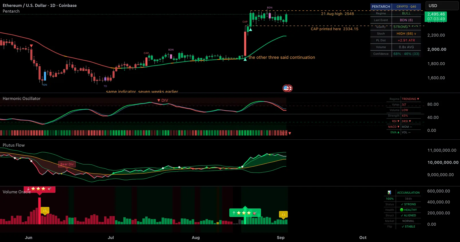
On 19 August, Pentarch printed CAP, its climax mark, on ETH's daily chart at 2334.15, on the high of the bar. That candle opened at 1916.76 and closed at 2251.69, a 17.5% day. The mark landed exactly where a climax call is supposed to land.
Price went up another 14%.
| 1 session later | +3.3% |
| 3 sessions | +7.6% |
| 5 sessions | +10.2% |
| furthest, within 15 sessions | +14.0% |
| deepest move against it | −1.4% |
ETH printed 2548 on 21 August, well above the level the mark called a climax at. There is no reading of that which flatters the indicator.
Two: check what the rest of the chart was saying
This is the step people skip, and it holds most of the value.
On that same bar, three other instruments were openly on the other side:
| instrument | on the CAP bar |
|---|---|
| Volume Oracle | bull signal, momentum footprint, high confluence signal |
| Harmonic Oscillator | six to nothing bullish, regime flipped to bullish |
| Plutus Flow | crossed up two days earlier, through its upper band the day before |
The cycle layer called a top. The volume, momentum and flow layers called a continuation. The continuation was right.
This is not a malfunction, it is the design working. These layers answer different questions on purpose. One asks where in a rotation price sits. The others ask whether the move underway has participation behind it. On 19 August those had opposite answers, and each instrument reported its own rather than being smoothed into agreement with the others.
A suite whose components never contradict each other is not a suite. It is one opinion wearing several costumes, and it will be confidently wrong all at once.
The top did arrive eventually. Harmonic reached extreme overbought three sessions later, Volume Oracle began flagging fading momentum from two sessions on, and Pentarch printed BDN at 2535.55 on 28 August. So the CAP was roughly nine sessions early, and on a bar that travelled 17.5%, nine sessions early is not a subtle miss.
Three: find a hit on the same chart
A miss on its own is as unrepresentative as a win.
Seven weeks earlier, on 29 June, the same indicator printed TD at 1547.77 on the low of the bar. Twenty sessions later the close stood 16.2% above that bar, and the deepest move against it was 3.9%.
Same indicator, same chart, seven weeks apart. One good call and one bad one. That is what an honest sample looks like, and it is the minimum you should accept before judging anything.
Four: check the marks have not moved
Everything above is worthless if the indicator quietly redraws its own history.
This matters more than it sounds. A tool that repaints produces a flawless looking chart every single time, and every story told from it is fiction. It is also nearly impossible to spot unless you deliberately go looking, because the evidence deletes itself.
So go looking. Put the chart in bar replay and walk it forward.
With the 19 August bar still forming, there is no CAP. Let that bar close at 2251.69, and there is still no CAP. The moment the next bar opens, CAP appears on the 19 August bar at 2334.15.
One quirk worth knowing on crypto charts: a daily bar dated 19 August closes at 00:00 UTC on the 20th. So the mark belongs to the 19th and becomes visible on the 20th. Both statements are correct.
Fifteen sessions later it is still on that bar, at that level. It was wrong, and it has not moved to make itself look better.
That is the mechanic in full: the mark confirms when its bar closes, is drawn on that bar, and never moves again. One bar of confirmation, nothing borrowed from the future, and no capacity to quietly improve itself afterwards.
Why this is the test that survives
An indicator that redraws cannot be caught being wrong, because no evidence remains. Which means this post would be impossible to write about it.
That is the whole argument, and it is a narrow one. Not that the marks are right. That you can go back and check them, including the ones that were not.
Run the four steps on whatever you use. Find its worst recent call. See what the rest of your chart was saying at the time. Find a good one for balance. Replay both.
If it passes, you have learned something real. If it does not, you have learned something considerably more useful.
Published as a TradingView Idea on ETHUSD. View the chart on TradingView
TD Touchdown, IGN Ignition, WRN Warning, CAP Climax, BDN Breakdown
Past chart behaviour, described after the fact. Nothing here is a recommendation or an indication of future results.