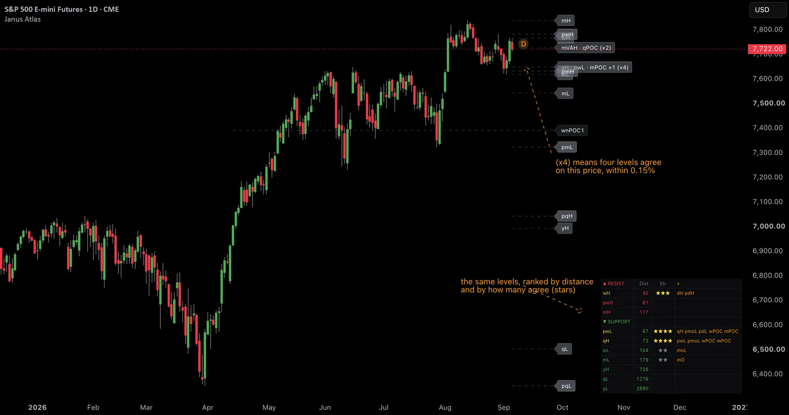
Published as a TradingView Idea on ES1!. View the chart on TradingView
Every trading chart eventually fills up with horizontal lines. Previous highs, previous lows, session boundaries, volume shelves. They are easy to draw, and once drawn they are very hard to argue with, because price spends its whole life moving between them. Sooner or later it touches one, and whatever happens next feels like the line caused it.
We wanted to know whether that feeling survives measurement.
What a level is
A level is just a remembered price. The high of last week. The low of last month. The price where the most volume traded during the quarter. Nothing mystical: these are places where a lot of people previously made decisions, and the argument for watching them is that people tend to make decisions in the same places again.
Our indicator Janus Atlas draws several families of these at once. When two or three land on nearly the same price, it marks how many agree. Traders generally treat that agreement as strength. Three levels stacked together is supposed to be a wall.
The mistake almost every level test makes
The obvious way to test a level is to check what price did when it arrived, and compare that to what price does normally.
That comparison is broken, and it is broken in a way that flatters the level. Price only ever tests a level on a bar that travelled far enough to reach it. Those bars are not ordinary bars. They are the energetic ones. So you end up comparing energetic bars to all bars, and concluding something about levels when you have actually measured something about volatility.
The fix is small and it changes everything. For every bar where price touched a real level, we also picked a random price inside that same bar and measured it exactly the same way. Same day, same volatility, same market conditions, and certain to be touched, because it sits inside the bar's own range.
Now the only difference between the two is whether the price meant anything.
What we measured
Two things, five bars forward.
Penetration. When price reached the level, how far through it did it go before turning? Measured in ATR, so a quiet market and a wild one are comparable.
Closed back. Five bars later, was price back on the side it came from? This is a simple yes or no. A coin flip would score 50%.
We ran it on thirteen instruments across futures, indices, individual stocks, crypto, currencies and commodities. About 54,000 daily bars, most of them going back to 2009.
The result
| what price touched | penetration | closed back |
|---|---|---|
| a random price in the same bar | 1.048 ATR | 50.2% |
| one level | 1.071 ATR | 50.3% |
| two levels agreeing | 1.110 ATR | 49.5% |
| three or more agreeing | 1.215 ATR | 45.4% |
Read the bottom row against the top one.
The prices where three or more levels agreed were cut through harder, and price closed back on the approach side less often, than a randomly chosen price on the very same day. The effect gets stronger as more levels agree, which is exactly the shape you would expect from a real relationship, except pointing the wrong way.
It was not a fluke of one market. It held on 13 of 13 instruments.
Notice also that the control landed on 50.2%, almost exactly the coin flip you would predict. That is what tells us the measurement itself is sound rather than broken.
The two objections we checked
A penetration measured in ATR gets inflated if the market happens to be unusually quiet at those moments. It was not: volatility at those touches was 0.999 against a typical day's 1.000.
And a finding that all happened in one year is not a finding. These spread across 18 years, with no year contributing more than 7.6%.
What we are not saying
We measured all available history with no piece held back. We used daily bars only. We covered the levels that come from price, and deliberately left out the ones that come from volume, because rebuilding that calculation ourselves would have meant testing our own copy rather than the real thing.
Most importantly, this describes what price did when it arrived somewhere. It is not advice, and there is nothing here to act on.
Why we published it
Because we would rather show you the method than the conclusion. The stacked-levels-are-stronger idea is repeated everywhere and, as far as we can measure, it is not what happens. Our own indicator draws those levels. We tested them anyway, and this is what came back.
The method is the part worth taking. It works on any levels from any source.
Published as a TradingView Idea on ES1!. View the chart on TradingView
Past chart behaviour and measurement, described after the fact. Nothing here is a recommendation or an indication of future results.