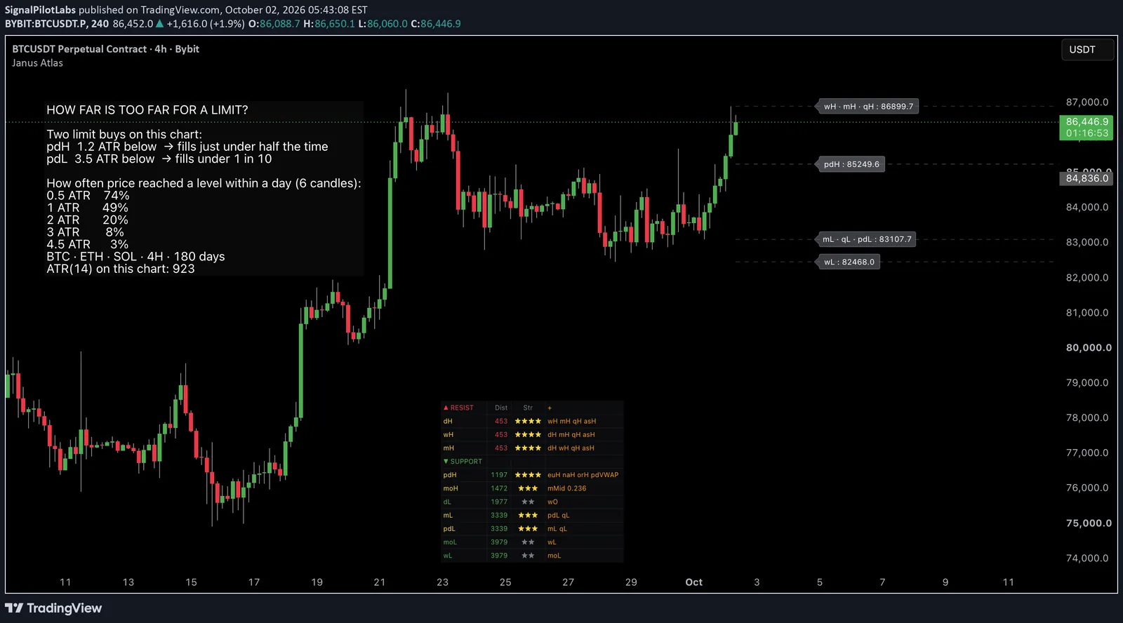
Published as a TradingView Idea on BTCUSDT. View the chart on TradingView
Every level on a chart looks like an entry. Most of them are a map. What separates the two is a question almost nobody asks before resting a limit: how often does price actually get that far?
We measured it. BTC, ETH and SOL on the 4 hour chart, every bar of the last 180 days. From each bar we placed a level a set distance away, measured in ATR, the average true range over 14 bars, and counted how often price reached it.
The table
| Distance from price | Reached within a day | Within five days |
|---|---|---|
| 0.5 ATR | 74% | 90% |
| 1 ATR | 49% | 78% |
| 1.5 ATR | 31% | 67% |
| 2 ATR | 20% | 56% |
| 3 ATR | 8% | 36% |
| 4.5 ATR | 3% | 18% |
| 6 ATR | 1% | 10% |
A day here is six 4 hour candles and five days is thirty. Every window is a complete one, which leaves 6,444 measurements behind each one-day figure and 6,300 behind each five-day figure.
It is almost the same for all three coins. A level 1 ATR away was reached within a day 49.9 percent of the time on BTC, 48.7 percent on ETH and 49.2 percent on SOL. That is the reason to measure in ATR: it turns a price gap into one number that means the same thing on every chart.
How to do it with Janus Atlas
- Turn on the Distance Table in Janus Atlas, under Inputs. It lists each level above and below price and how far away it is.
- Add the Average True Range, length 14, on the same timeframe, and divide each distance by it.
- Read the chance off the table above.
A worked example, 17:53 UTC on 30 September
BTC was at 83,984 and the 4 hour ATR was 970.
| Level | Distance | In ATR | Within a day | Within five days |
|---|---|---|---|---|
| Prior day high | 572 | 0.59 | 70% | 90% |
| Day low | 1,100 | 1.13 | 43% | 73% |
| Month high | 3,400 | 3.51 | 7% | 34% |
| Month low | 9,065 | 9.35 | 0% | 2% |
In 180 days of data, price never travelled as far as that month low within a single day. A limit resting there is a map, not an order.
Those four are measured on the side each level actually sits, above price for the highs and below for the lows, which is why they do not land exactly on the rows in the first table. Over these 180 days the market drifted up, so a level above price was reached slightly more often than one the same distance below. At 4.5 ATR it was 4 percent above against 1 percent below.
Our own record says the same
Our scanner put up 6,524 limit proposals between 29 July and 3 August. The ones resting within 0.75 ATR of price filled 62 to 78 percent of the time. The ones beyond 4.5 ATR filled 2 to 5 percent of the time.
The trap we nearly published
Our first read of that record said 597 limits resting 4.5 ATR or more away had filled zero times.
It was read before those setups had finished their window. Fully graded, it was 10 of 597. Close to zero is not zero, and a trade that is still young is not a miss. Count only what has had its full chance.
What this does not tell you
Reached is not profitable. The table says whether a limit would fill, not whether the trade works once it does. There is no return anywhere in this post, and none is implied.
The Distance Table is live: its numbers move with price even when no level has moved. That is why the worked example above carries a timestamp, and why reading it again an hour later will give you different distances for the same levels.
In sample, three coins, one timeframe, the 180 days to 30 September.
Observations, not recommendations.
Published as a TradingView Idea on BTCUSDT. View the chart on TradingView
Past measurement described after the fact. Nothing here is a recommendation or an indication of future results.