Published as a TradingView Idea on BTCUSDT. View the chart on TradingView
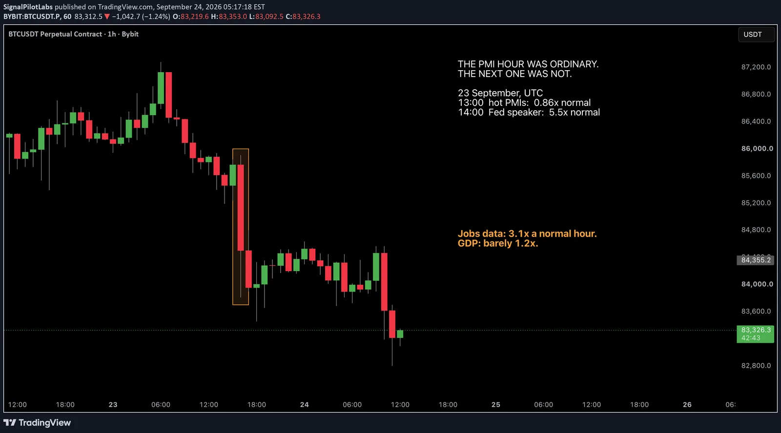
On 23 September at 13:45 UTC the US flash PMIs printed hot. Manufacturing came in at 57.0 against 53.6 expected, services at 58.7 against 56.0. Twenty minutes later, at 14:05, a Federal Reserve governor was scheduled to speak.
Measure the two hours the same way and they look nothing alike.
The hour containing the PMIs, 13:00 to 14:00 UTC, moved BTC, ETH and SOL a median 0.86 times their ordinary hour. Which is to say, an ordinary hour.
The next hour, the one with the Fed speaker in it, moved them 5.54 times their ordinary hour. BTC fell 1.47 percent inside it.
One day is one case, and landing near a move is a coincidence in time rather than proof of cause. We are not claiming the speech caused the fall. What makes the day worth opening on is that it is the order thirteen months of data would have predicted, and that data is the rest of this post.
The method, which needs nothing but hourly candles
Take a release. Find the hour it landed in. Measure that hour open to close, as an absolute percentage, so a fall of one percent and a rise of one percent count the same.
Now divide that by the same coin’s median hourly move over the whole window. That is the denominator doing the work: it is what an ordinary hour looks like for that coin, and it differs between coins. Over this window an ordinary BTC hour moved 0.19 percent, an ordinary ETH hour 0.27 percent and an ordinary SOL hour 0.33 percent.
The result is a ratio. A 1.00 means the release hour looked like any other hour. A 3.00 means it moved three times as much. We did this for BTC, ETH and SOL and took the median of the three, so one coin having a bad afternoon cannot carry a category on its own.
The sample is every US release TradingView flags as high importance between 12 August 2025 and 15 September 2026: 399 days, 303 releases.
The ranking
Grouped by the kind of release, in multiples of an ordinary hour, with the number of distinct hours each figure rests on:
| Category | Times an ordinary hour | Hours |
|---|---|---|
| Labour, the jobs data | 3.14 | 26 |
| Fed and money | 2.10 | 24 |
| Business, such as the PMIs | 1.83 | 39 |
| Prices, such as CPI and PPI | 1.70 | 38 |
| Consumer | 1.57 | 38 |
| Housing | 1.38 | 24 |
| GDP | 1.16 | 13 |
Three things in that table are worth saying out loud.
The jobs data moves crypto more than anything else on the calendar, inflation included. An ordinary BTC hour in this window moved about 0.19 percent, and a labour data hour has run to roughly three times that.
GDP is flagged high importance and measured barely different from an ordinary hour. Whatever the release is telling economists, the hour it lands in has not been a notably large one.
And the PMIs that opened this post were not in the sample at all. TradingView rates them medium importance, so they never met the bar. The 23 September hour behaved like the category it belongs to anyway, at the low end of it.
Why the ranking is by category and not by release name
This is the part that changes the answer, so it is worth doing slowly.
Several releases print in the same minute. CPI is the clearest case: it arrives as four lines, headline and core, each month over month and year over year. Rank by release name and those four lines are four entries.
But they are one hour. They share an open and a close, so they share a numerator, and they share a denominator too. All four therefore measured an identical 1.85 times an ordinary hour, and they were always going to. That identity is not a finding about CPI. It is the arithmetic telling you that you counted one event four times.
So each hour is counted once here, however many lines print inside it. That is why the third column of the table says hours rather than releases, and why 303 releases produce 202 ranked hours.
It matters more than it sounds. Counted by release name rather than by hour, consumer and housing swap places in the middle of the table, because the categories that publish several lines per print were being counted several times each. The top four and the bottom one hold either way, which is the reassuring half of the answer.
What this does not tell you
It measures how much the hour moved, not which way. Nothing here says a release sends price up or down, and a large ratio is as consistent with a sharp rally as with a sharp fall.
It is not a signal. It says how a category’s hours have compared with ordinary hours over one window, not that the next one will.
It is in sample: one window of thirteen months, three coins, one exchange’s hourly bars. Seven categories were ranked, and ranking seven things means some of them will separate by luck, so treat the small gaps in the middle of the table with more caution than the ends. An eighth category, Fed governance, had only three releases in the window and was left unranked rather than reported on a sample that thin.
What it is good for
Knowing what you are holding into.
A position carried through the jobs data is sitting in an hour that has moved three times normal. The same position carried through a GDP print is sitting in an hour that looks like any other. Those are different amounts of exposure to the same nominal position size, and the calendar tells you which one you are about to get.
That is the whole use. Not a trade, a unit of measurement.
Observations, not recommendations.
Published as a TradingView Idea on BTCUSDT. View the chart on TradingView
Past measurement described after the fact. Nothing here is a recommendation or an indication of future results.