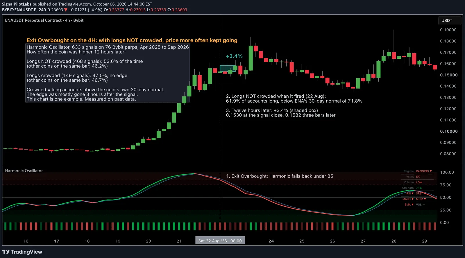
Published as a TradingView Idea on ENAUSDT. View the chart on TradingView
Every trading book treats overbought as a warning that a move is stretched. We measured 633 times Harmonic Oscillator printed Exit Overbought on the 4 hour chart across 76 Bybit perpetuals, and twelve hours later the coin was more often higher than its peers, not lower. What separated the two kinds of overbought was a number most traders never look at: how crowded the long side already was.
“Overbought” is one of the first words a new trader learns, and it almost always arrives with an instruction attached: the move is stretched, so be careful, take profit, look for the turn. Oscillators are built around it. Most charting platforms colour the zone red.
We build one of those oscillators, so we wanted to know what the word had actually meant on the 4 hour chart. Not what it is supposed to mean. What followed it.
How it was measured
Harmonic Oscillator combines RSI, Stochastic RSI and MACD into one composite line. When that line pushes above 85 it prints Extreme Overbought. When it falls back under 85 it prints Exit Overbought, the moment the stretch starts to unwind.
We took every Exit Overbought on the 4 hour chart across 76 perpetual futures on Bybit: 63 crypto coins and 13 stock, ETF and commodity contracts. The window ran from 22 April 2025 to 29 September 2026, about seventeen months. A repeat within three bars counted once, which left 633 first fires.
For each one we asked a plain question: twelve hours later, three bars on, was the coin higher than where the signal printed?
A share on its own says little, because markets move together. If everything rose that day, a signal that “worked” may just have been the tide. So every fire was compared with other coins on the same bar that had a similar run-up over the previous twenty bars, and any coin firing the same signal on that bar was left out of the comparison. What is left is the coin and its signal, with the day’s market taken out.
What followed, twelve hours later
| Exit Overbought, 4 hour chart | Signals | Coin higher 12 hours later | Other coins, same bar | Median 12 hour move |
|---|---|---|---|---|
| All | 633 | 52.4% | 46.7% | +0.16% |
| Longs not crowded | 468 | 53.6% | 46.2% | +0.26% |
| Longs crowded | 149 | 47.0% | 46.7% | -0.47% |
The overbought coin was higher 52.4 percent of the time. The comparison coins on the same bars were higher 46.7 percent of the time. The median twelve-hour move after the print was +0.16 percent.
That second number matters as much as the first. The comparison coins rose less than half the time, so the period leaned down, and the coins that had just printed overbought still did better than their peers. On this timeframe, overbought more often marked a pause than a top.
Extreme Overbought, the print that comes first, behaved the same way overall: 623 fires, higher 50.7 percent of the time against 46.0 percent.
The crowd decided which kind of overbought it was
An average hides two different situations, so we split the fires by positioning. For each one we read Bybit’s long/short account ratio at the bar’s close and compared it with that coin’s own median over the previous 30 days. Above its median, longs were crowded. Below it, they were not. The remaining 16 fires could not be placed in either group.
Longs not crowded, 468 fires: higher 53.6 percent of the time, against 46.2 percent for the comparison coins. Median move +0.26 percent.
Longs crowded, 149 fires: higher 47.0 percent of the time, against 46.7 percent. Median move -0.47 percent.
When the crowd was not already leaning long, overbought more often meant the move kept going. When it was, the difference against peers disappeared, and the typical twelve hours ended lower.
We do not know why, and we will not pretend we do. One reading that fits: a move nobody has piled into yet still has buyers left to come, while a move everyone is already long has used them up. That is a story, not a measurement.
It fades fast
The difference was 5.8 points if you read the signal at the print. Come in one bar later and it was 5.0. Two bars later, eight hours after the print, it was 1.3.
So whatever this is, it is short-lived. A trader who notices the print the next morning has mostly missed it.
How we checked it was not noise
Every test below was written down before it ran.
First, a price twin: each fire against coins that had made the same move on the same bar, so the result is not just “coins that went up kept going up”. Second, a volume twin: the same comparison, also matched on volume. Third, we reran the whole measurement on ten versions of shuffled history, to see how often luck alone produces a gap this size.
It held up in all three. That is still a measurement of the past. We have started counting it forward from 3 October, on bars that did not exist when we measured, and we will publish what that count shows whichever way it goes.
One example on the chart
ENA, 4 hour chart, 22 August 2026. Harmonic’s composite read 87.50, then 84.58 on the next bar, back under 85: Exit Overbought, the first in twelve days. At that close 61.9 percent of ENA accounts were long, below ENA’s own 30-day normal of 71.8 percent. Not crowded.
Three bars later ENA had gone from 0.15303 to 0.15823, 3.4 percent higher.
It is one example, chosen to show the case clearly. The numbers above cover all 633.
How to use it
- On the 4 hour chart, note when Harmonic prints Exit Overbought.
- Look up that coin’s long/short account ratio and compare it with its last 30 days.
- If it is below its usual level, overbought has more often been a pause inside a move that keeps going. If it is above, treat the print as a warning worth respecting.
- Read it quickly or not at all. Most of the difference was gone eight hours after the print.
What this does not tell you
Higher more often is not a trade. The difference is a few points of probability and the median move is small, so on short holds fees take a real share of it. It is one timeframe, one seventeen-month stretch, and it was measured on data we already had. The comparison with same-bar peers removes the market’s move, but it cannot remove everything those coins had in common.
There is no entry, stop or target in this, on purpose.
Observations, not recommendations.
We are Signal Pilot Labs. We build the Elite Seven, seven indicators for TradingView, and we post what we measure, the results that flatter us and the ones that do not.
See what we build at signalpilot.io.
Published as a TradingView Idea on ENAUSDT. View the chart on TradingView
Past measurement described after the fact. Nothing here is a recommendation or an indication of future results.