Published as a TradingView Idea on BTCUSDT. View the chart on TradingView
The week of 28 September carries two US jobs reports. One of them has moved crypto more than any other release on the calendar. The other has never once had a quiet hour.
They are not the same release, and they are not the same risk.
| Release | When, UTC | Times an ordinary hour | Quiet hours |
|---|---|---|---|
| JOLTs | Tuesday 29 September, 14:00 | 3.69 | 4 of 12 |
| Core PCE, income and spending | Wednesday 30 September, 12:30 | 1.04 | 6 of 12 |
| ISM manufacturing | Thursday 1 October, 14:00 | 2.59 | 4 of 13 |
| Payrolls and unemployment | Friday 2 October, 12:30 | 2.64 | 0 of 12 |
How we measure it
For each release, take the hour it lands in and measure that hour’s move, open to close, as an absolute percentage. Divide by the coin’s median hourly move over the same window. A 1.00 means the release hour looked like any other hour.
We use BTC, ETH and SOL and take the median, over 399 days of releases that TradingView flags as high importance.
Each hour is counted once, however many lines print inside it. That correction is not cosmetic. JOLTs has thirteen releases in our window but twelve distinct hours, because the 2025 shutdown pushed two reports into the same minute on 9 December, and that one hour moved 13.7 times normal. Counting it twice reads JOLTs at 3.95 instead of 3.69. Payrolls has thirteen rows over twelve hours too, and reads 2.82 instead of 2.64.
The full ranking of every US release is in our previous post.
Tuesday: JOLTs
Median hour: 3.69 times an ordinary hour, the highest of any US release with a year of history. On the eight hours it had to itself, with nothing else printing in the same minute, 4.33 times.
Then look at the twelve hours one by one. The biggest moved 14.5 times normal. Four of the twelve moved less than an ordinary hour, and the most recent one, on 1 September, was one of them.
JOLTs is big when it moves, and about a third of the time it does not.
Wednesday: four red flags in one minute
At 12:30 UTC, Core PCE, personal income and personal spending all print in the same minute, and this week the final GDP estimate joins them. TradingView flags every one of them high importance.
That hour has measured 1.04 times an ordinary hour, and half of its twelve hours were quieter than normal. Four high-importance lines land together, and the hour they land in has looked like any other hour.
Thursday: ISM manufacturing
2.59 times an ordinary hour, over thirteen hours, four of them quieter than normal. Middling on both counts: it moves, usually, and not by as much as the jobs data.
Friday: payrolls
Median hour: 2.64 times an ordinary hour. Lower than JOLTs.
But all twelve of its hours moved more than an ordinary hour. Not one was quiet.
It prints in the same minute as the unemployment rate every time, thirteen times out of thirteen in our window, so treat the two as one event rather than two.
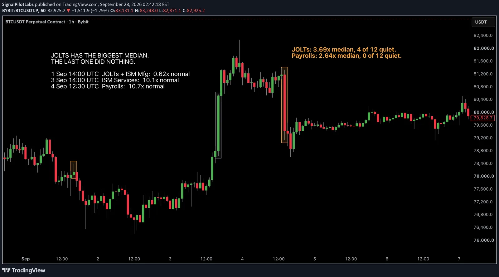
The chart is the last jobs week
The chart above is BTC hour by hour from 31 August to 6 September, the last time both reports landed in the same week.
JOLTs on 1 September, sharing its minute with ISM manufacturing: 0.62 times an ordinary hour. ISM services on 3 September: 10.1 times, the biggest candle body in the frame. Payrolls on 4 September: 10.7 times.
We picked those three by a rule rather than by eye: the latest print of each. The rule happened to land on the second-quietest of JOLTs’ twelve hours and the largest of payrolls’ twelve. That is worth saying out loud, because the frame flatters the argument more than the medians do. The medians are the fairer number, which is why they are on the chart as well.
Size and likelihood are different questions
This is the whole piece. JOLTs has the bigger number and payrolls has the better record.
A median tells you how big a typical release hour was. It does not tell you how often the release did anything at all. These two separate on exactly that: the release with the bigger typical hour is also the one that has done nothing four times out of twelve, while the smaller one has never once been quiet.
Our first pass compared them on the median alone and stopped there. The distribution told a better story than the median did.
What this does not tell you
Which way. It measures how much the hour moved, not the direction, and it is not a signal. The chart makes that concrete: the 3 September hour is a large green candle and the 4 September one is a large red candle, and both count the same here.
Twelve hours per release is a small sample. With about thirty release names compared, one of them landing at the top partly by luck is expected rather than surprising, and JOLTs is the one at the top. It is in sample, thirteen months, three coins, and none of it has been tested forward.
What it is good for is knowing what you are holding into. A position through JOLTs is holding something that has done nothing about a third of the time and a great deal the rest of it. A position through payrolls is holding something that has moved every single time.
Every figure here comes from hourly price data and TradingView’s economic calendar, over 399 days to 15 September. None of it comes from our indicators, and there is no indicator on the chart.
Observations, not recommendations.
Published as a TradingView Idea on BTCUSDT. View the chart on TradingView
Past measurement described after the fact. Nothing here is a recommendation or an indication of future results.