Published as a TradingView Idea on ETHUSDT. View the chart on TradingView
A scanner is a leaderboard. Something decides the order, and it is usually not the column you are looking at.
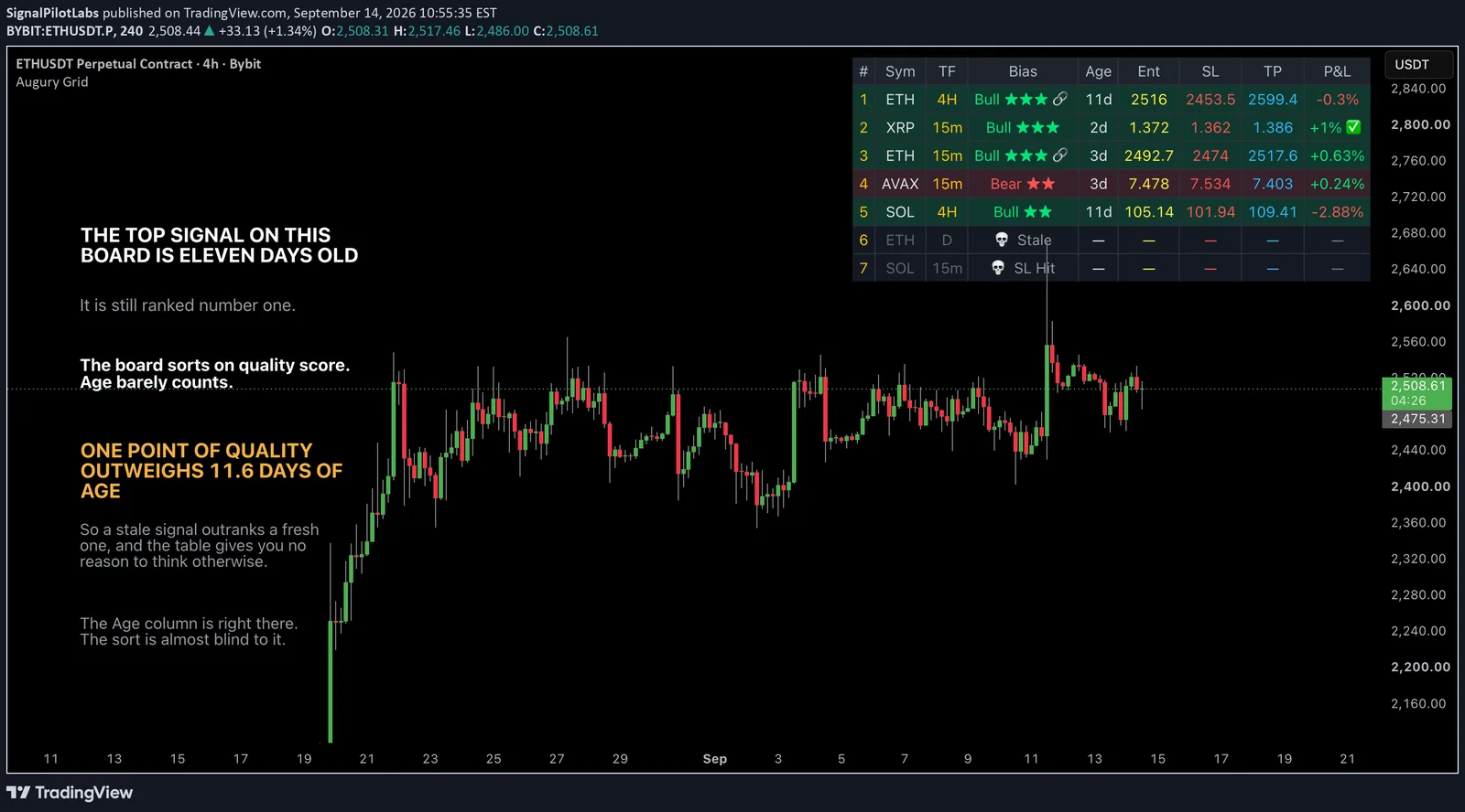
This is our own multi-timeframe scanner. It shows seven rows out of twenty-one scanned cells, each with a bias, a star rating, an age, an entry, a stop, a target and a running P&L. Here is what actually sorts it.
First, what it does that most scanners do not
It tells you why it is silent. When a row has no signal it names the missing condition rather than going blank. There are twelve of them: waiting on the MACD cross, on trend alignment, on the 200 EMA, on ADX, on volume, on the histogram, on momentum, on score, or flagged as RSI extreme, price extended, stop hit, stale.
A scanner that says “waiting on volume” is teaching you the setup. One that shows an empty list is a black box.
And the gate is genuinely strict. For a signal to fire, ten conditions must be true at the same time:
| MACD cross | trend alignment |
| price the right side of the 200 EMA | ADX above its floor |
| RSI not at an extreme | price not overextended |
| volume spike | histogram amplitude |
| momentum agreement | quality score of 70 or better |
Plenty of scanners fire on one. That is why the rest of this is worth doing: a tool this explicit about its conditions has earned the same care applied to its ranking.
One. Age is displayed and barely ranked on
The ranking line is this:
rank = score × 1000 - (timenow - ts) / 1000000 // ts in millisecondsPut numbers through it:
| term | value |
|---|---|
| one day of age costs | 86.4 rank units |
| one score point is worth | 1000 rank units |
| so one score point equals | 11.6 days |
A signal has to sit there for a week and a half before its age costs one point of score. The Age column sits right there in the table and the sort is almost blind to it.
That is why a stale row can hold the top slot on a board people read as “what is happening now”.
And the unit hides it further
Age prints in days for every row, whatever the timeframe.
| row | age shown | bars old |
|---|---|---|
| 4H signal | 11d | 66 |
| 15m signal | 2d | 192 |
The bigger looking number is the fresher setup. On the live board, the fastest timeframe was carrying the oldest trades by roughly three times.
Two. The confluence bonus is added after the cap
Start with the part that is done well. The confluence count is direction aware. A symbol showing two bullish signals and one bearish is counted as two, not three. That sounds obvious and it is precisely what implementations get wrong, because the lazy version counts how many timeframes have a signal rather than how many agree.
So the counting is careful. It is the weighting that is not.
Quality is scored out of 100 and clamped there. Then a bonus is added on top: 15 more if the same signal appears on two timeframes, 30 if on three. Stars are awarded at 95 and 85.
| setup | final score | stars |
|---|---|---|
| barely clears the 70 minimum, on 3 timeframes | 100 | ★★★ |
| near perfect standalone | 94 | ★★ |
The cap applies to quality and is then bypassed by agreement.
And we have measured what that agreement is worth. Agreement across timeframes came out at 0.60 times chance in our own data. Below luck. It is the single largest term in the ranking, attached to the weakest evidence we have.
Three. The board deletes its losers
When price passes a signal’s stop, the signal stops being a signal and leaves the table.
So every row still showing is, by construction, one that has not stopped out. Reading the P&L column as a track record means selecting on survival and then measuring the survivors.
This is correct behaviour for a scanner. A dead setup should not occupy a slot. It is only misleading if you read the column as history, which is what the eye does with a column called P&L.
Four. The P&L column is clipped at both ends
If the running result is past the stop it prints the stop distance. If it is past the first target it prints the target distance.
So a row reading +1% with a tick beside it is not the result. It is the distance to target one, reached or exceeded. Winners are truncated and losers are floored.
Also defensible, because it stops a stale row printing -60%. And it means the column cannot be summed, averaged or compared between rows.
The point is not that the tool is wrong
Every one of those is a reasonable design decision. None is a bug.
Together they mean the board shows survivors, ordered almost without regard to age, with results clipped at both ends, and a star rating dominated by a bonus for a property we measured below chance.
The job is not to distrust it. It is to know which column answers which question. Bias and stars decide the order. Age informs and barely sorts. P&L describes the survivors and only the survivors.
How to do this to your own scanner
Find the line that computes the rank. Not the one that draws the table, the one that sorts it. Then put real numbers through it.
Ours looked balanced until we asked what one day of age was worth against one point of score, and the answer was 11.6 days to the point.
If you cannot find that line, you do not know what your leaderboard is ordering on, and the column you are reading is probably not it.
The honest scope
Not a backtest, and not a claim about whether these signals make money. Nothing here measures outcome. It is a reading of how a display is built, from its own source, and it reproduces on any scanner whose code you can see.
Published as a TradingView Idea on ETHUSDT. View the chart on TradingView
Past measurement of our own tooling, described after the fact. Nothing here is a recommendation or an indication of future results.